Project
The Creeper
For this project we had to design a logo based off a creature from fairytales, legends and movies. I was assigned The Creeper from Jeepers Creepers, it is a evil creature that hunts his prey by smelling their fear. Once he has captured them he brings them back to his lair where he devours them and uses their corpse to decorate.
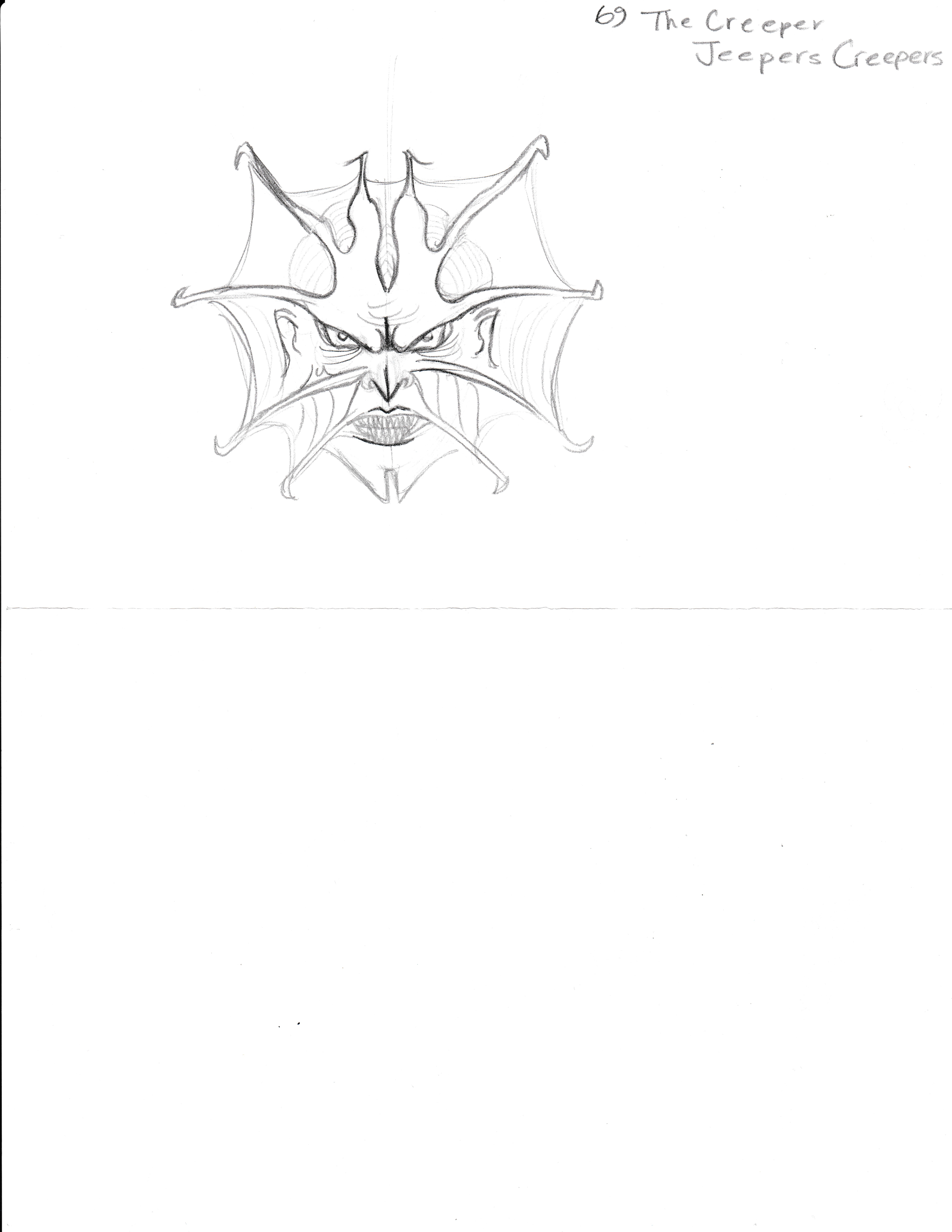
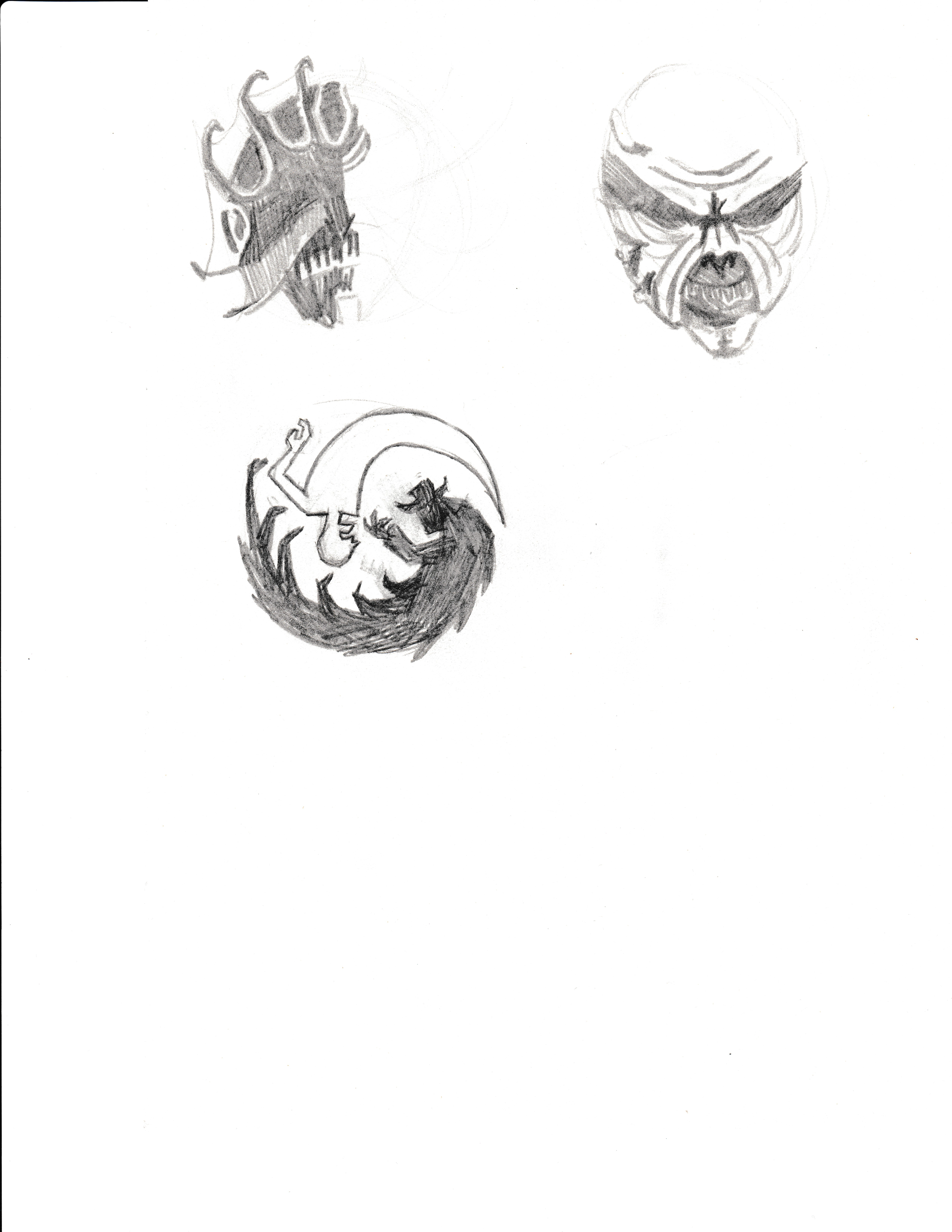
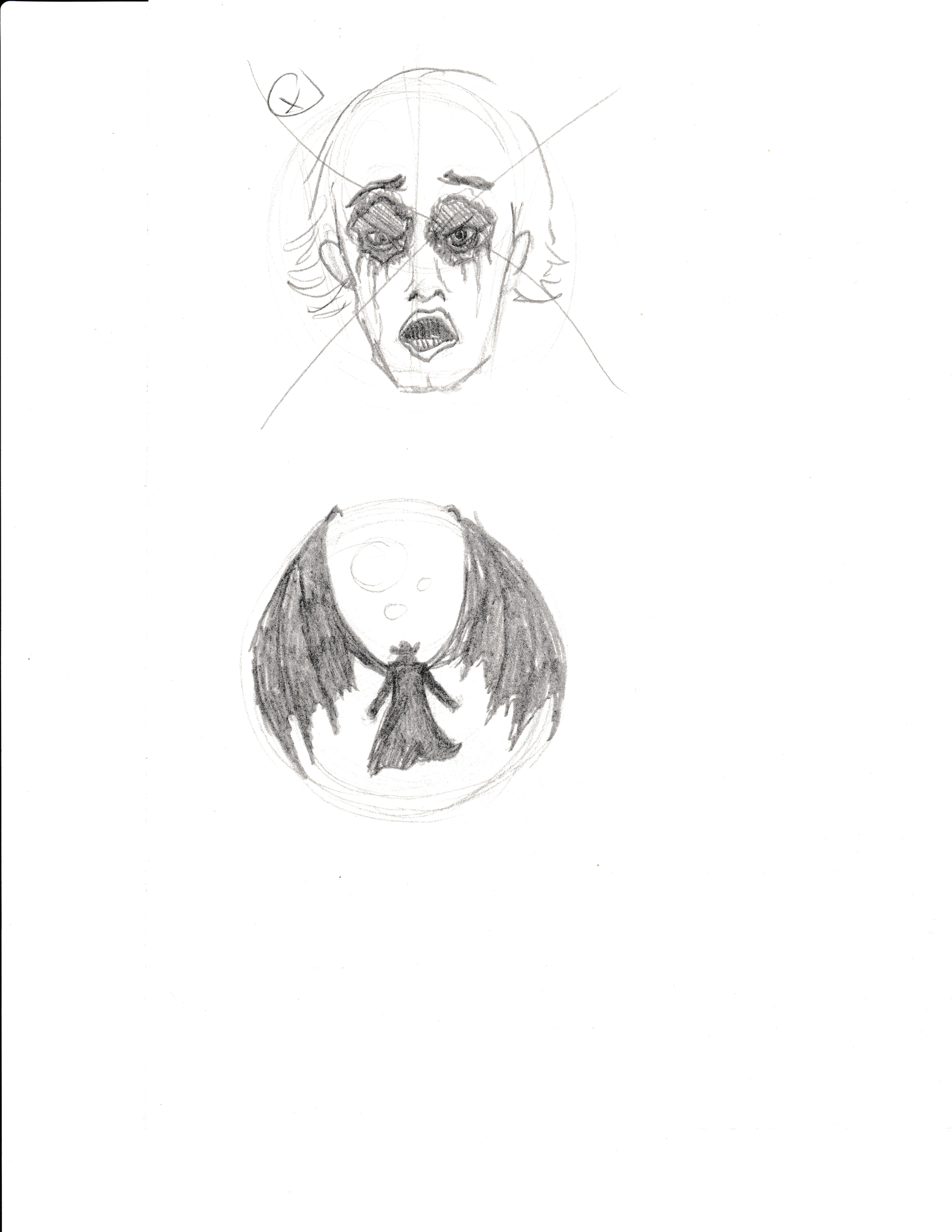

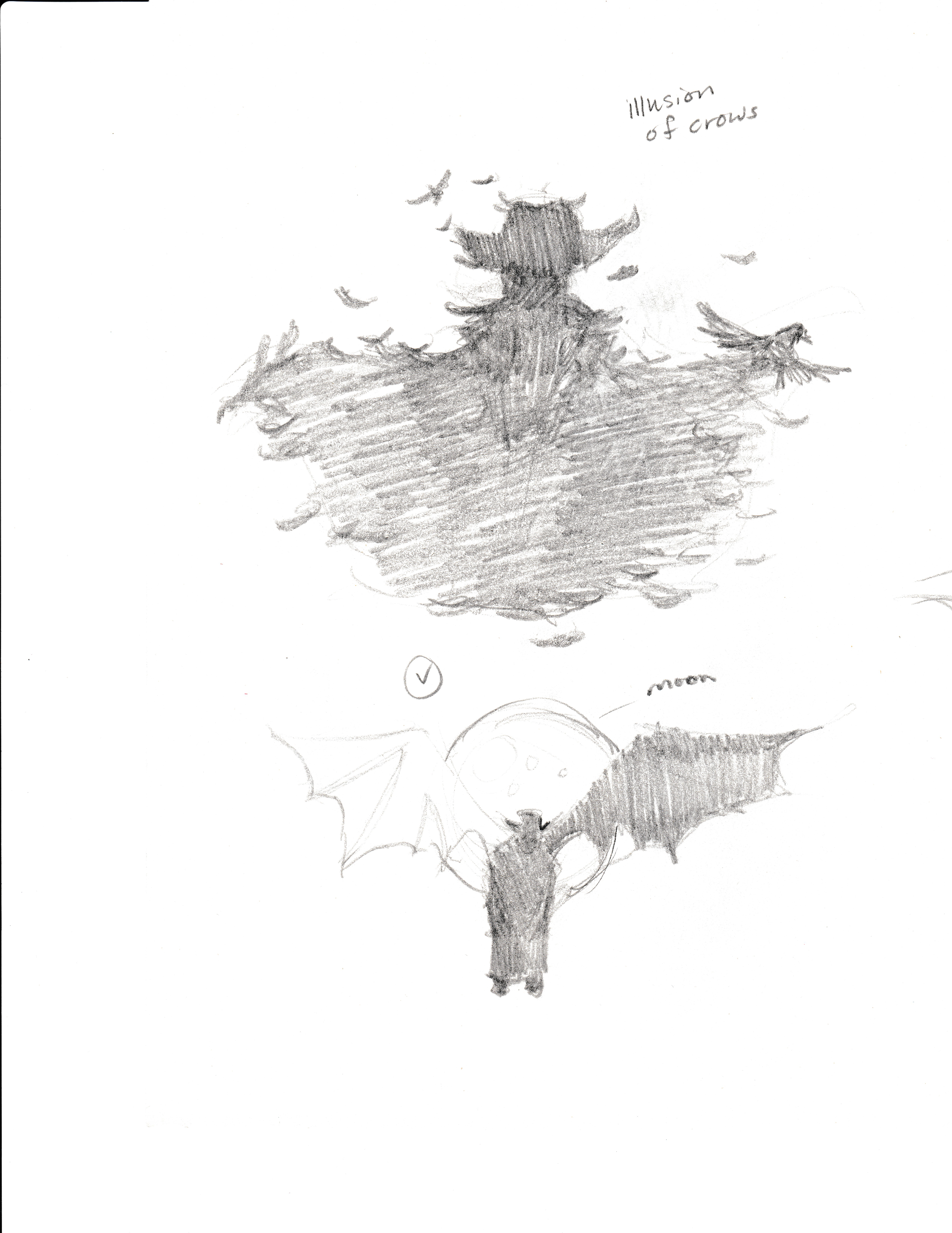
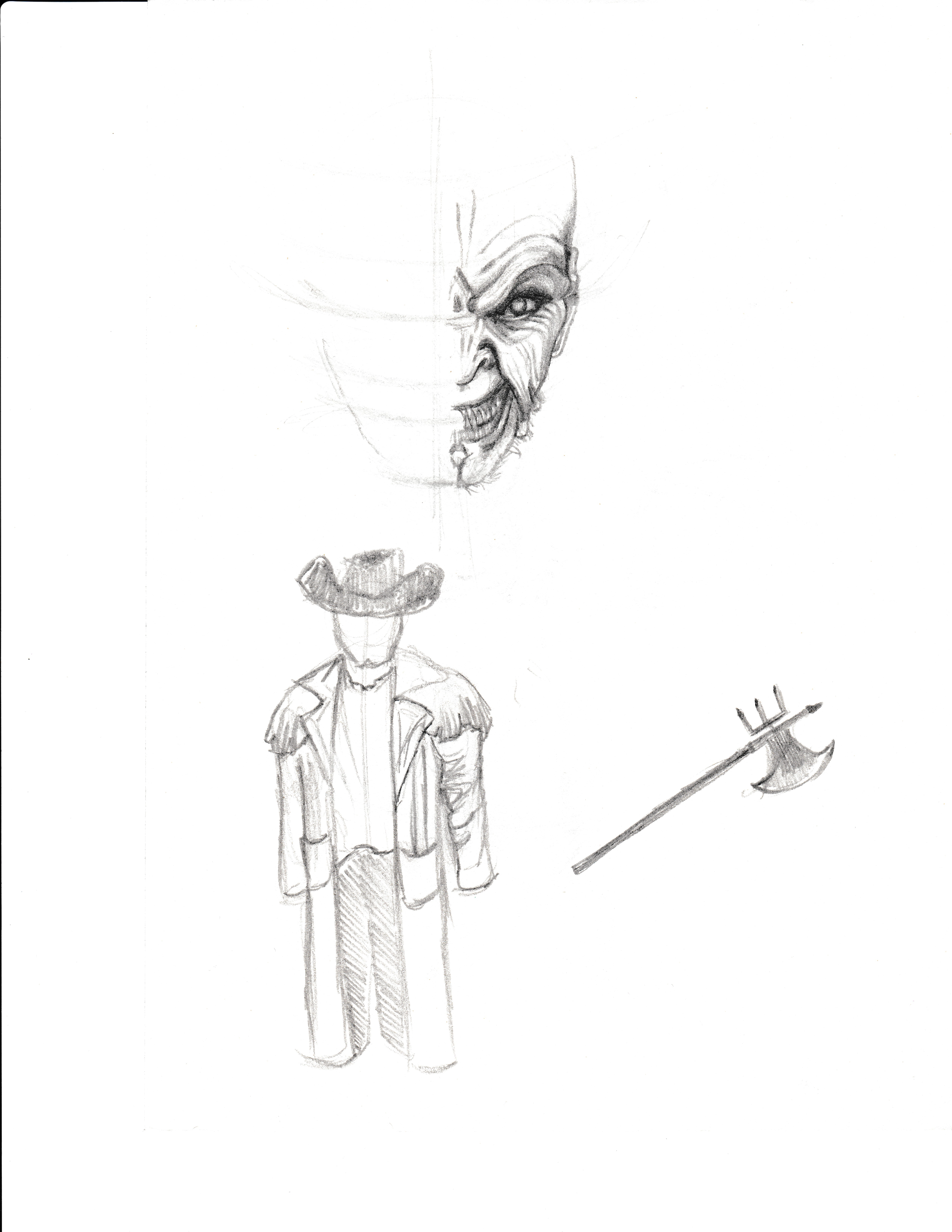
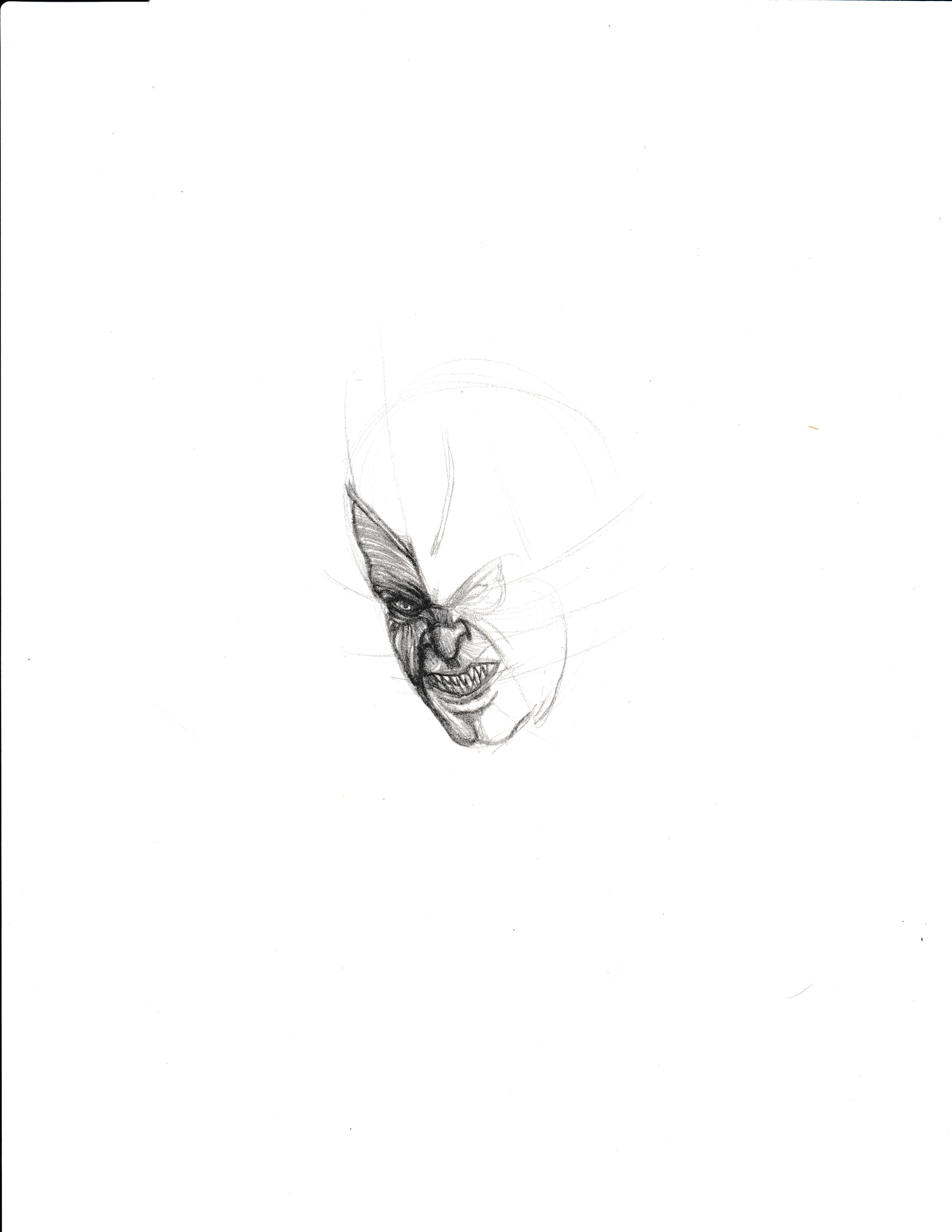
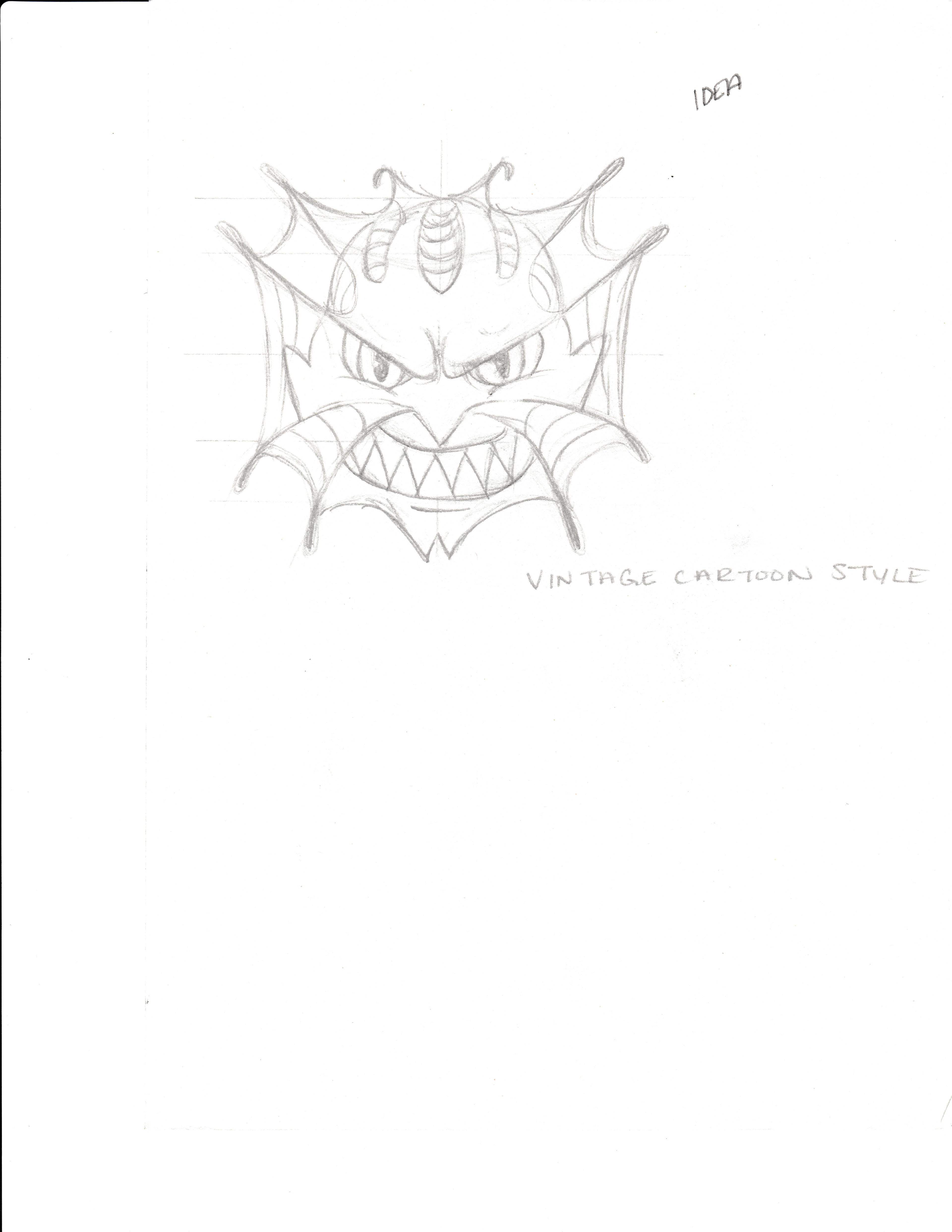
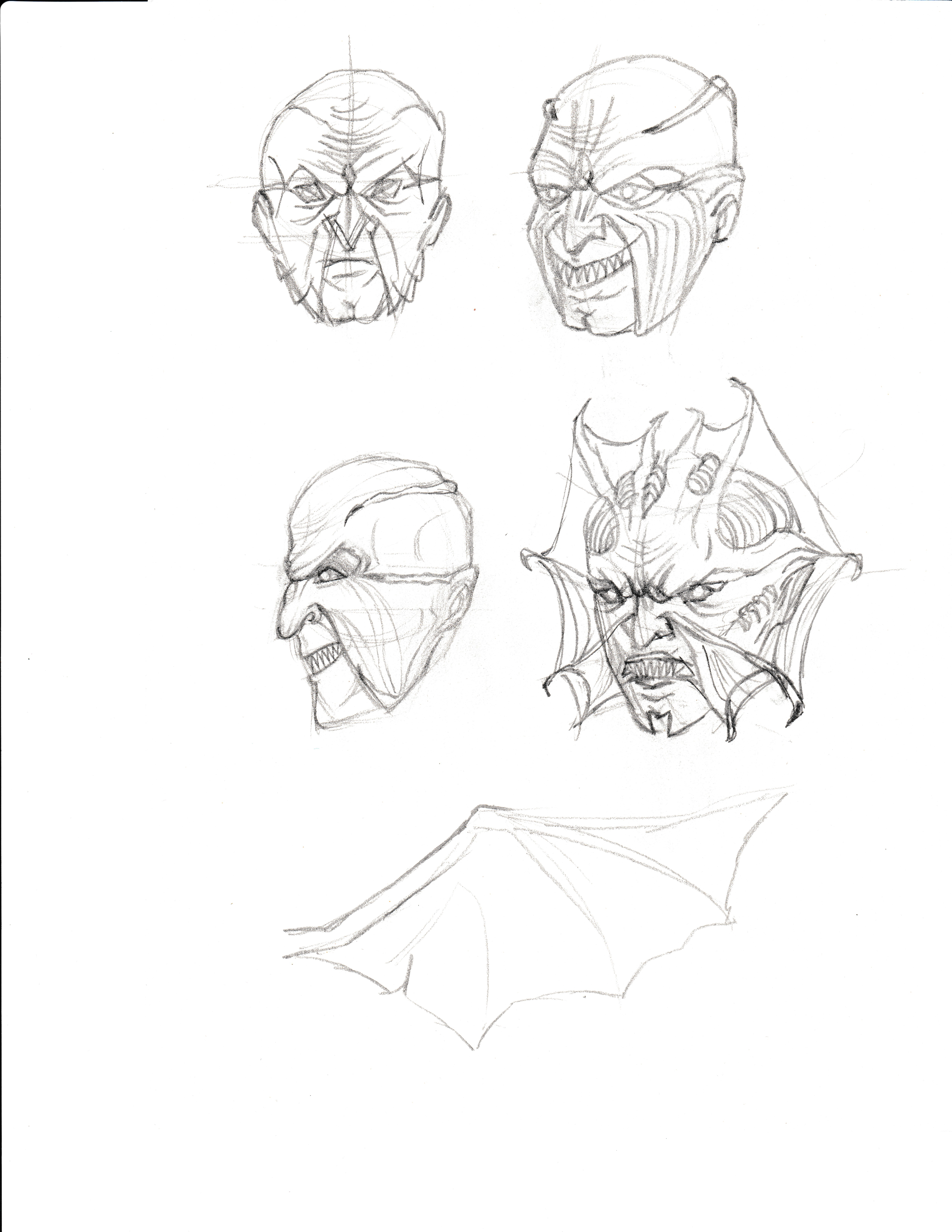
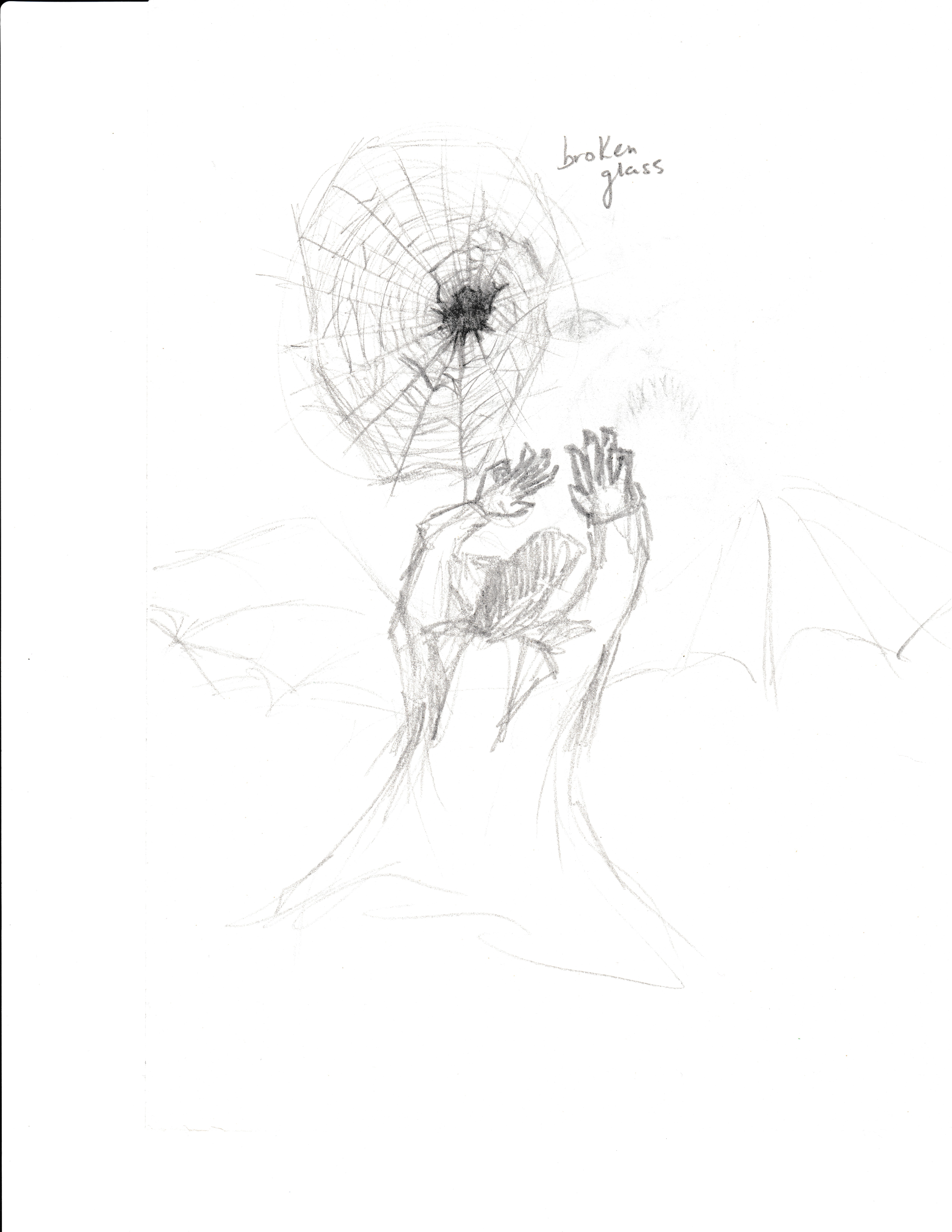
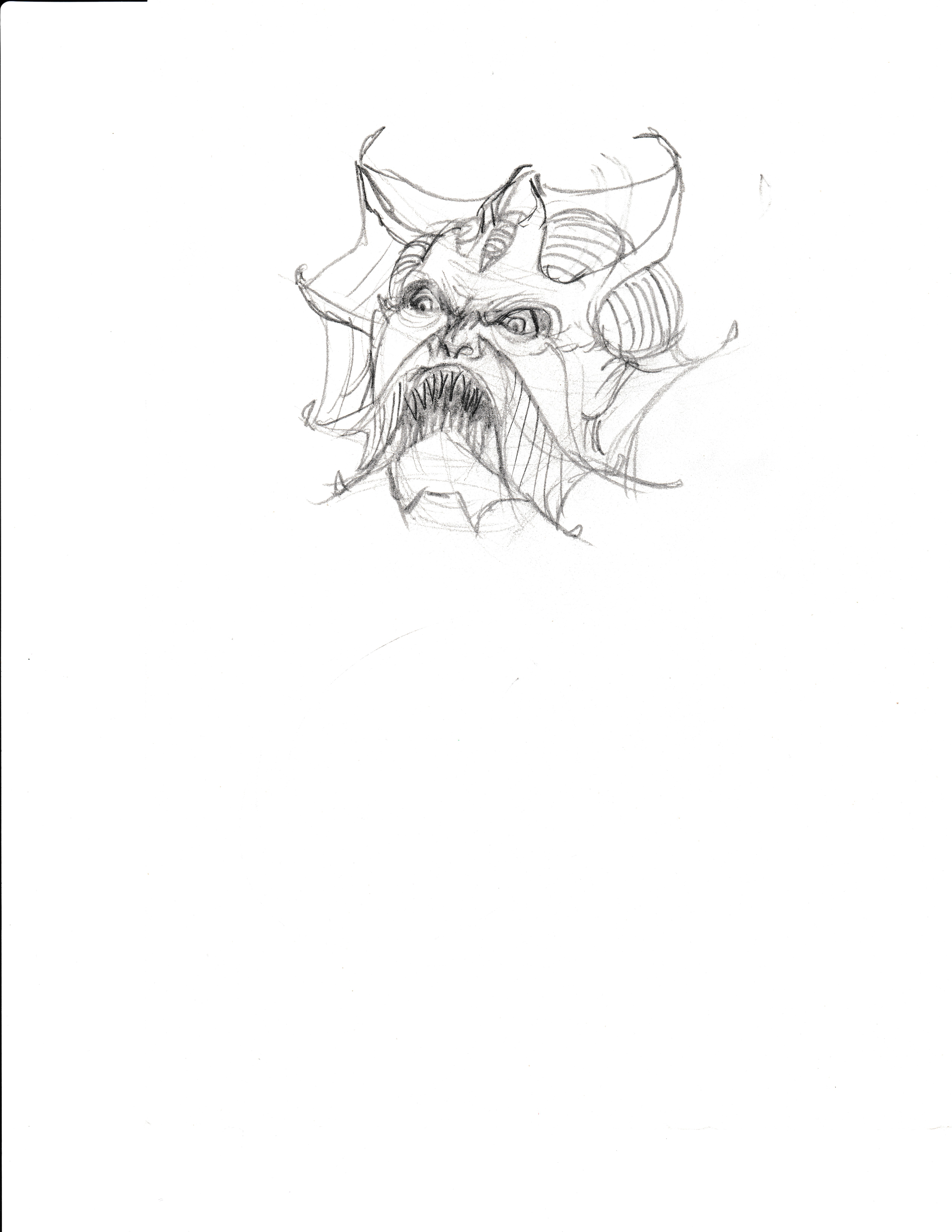
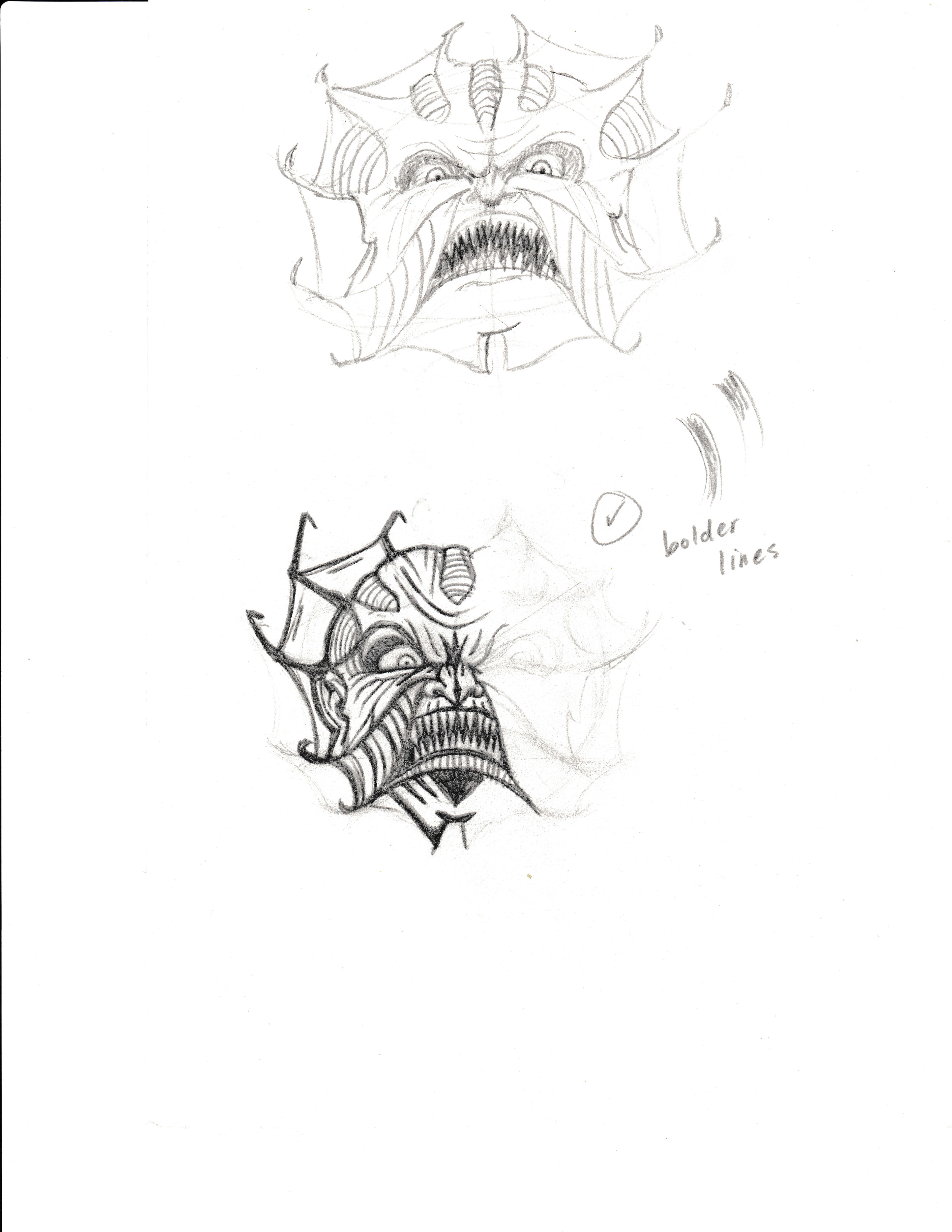
Concept Sketches
Design & Concept
After researching the story behind The Creeper I wanted to have the logo to be scary. This creature is in horror movies and preys on his victims fear. I originally had a more detailed design but considering that the logo had to be visible at smaller sizes it had to be simplified. Instead what I focused on was his face and used that as the main focal point. The angle was chosen to make him look more menacing and also show the viewer how his victims would see him if he caught them.
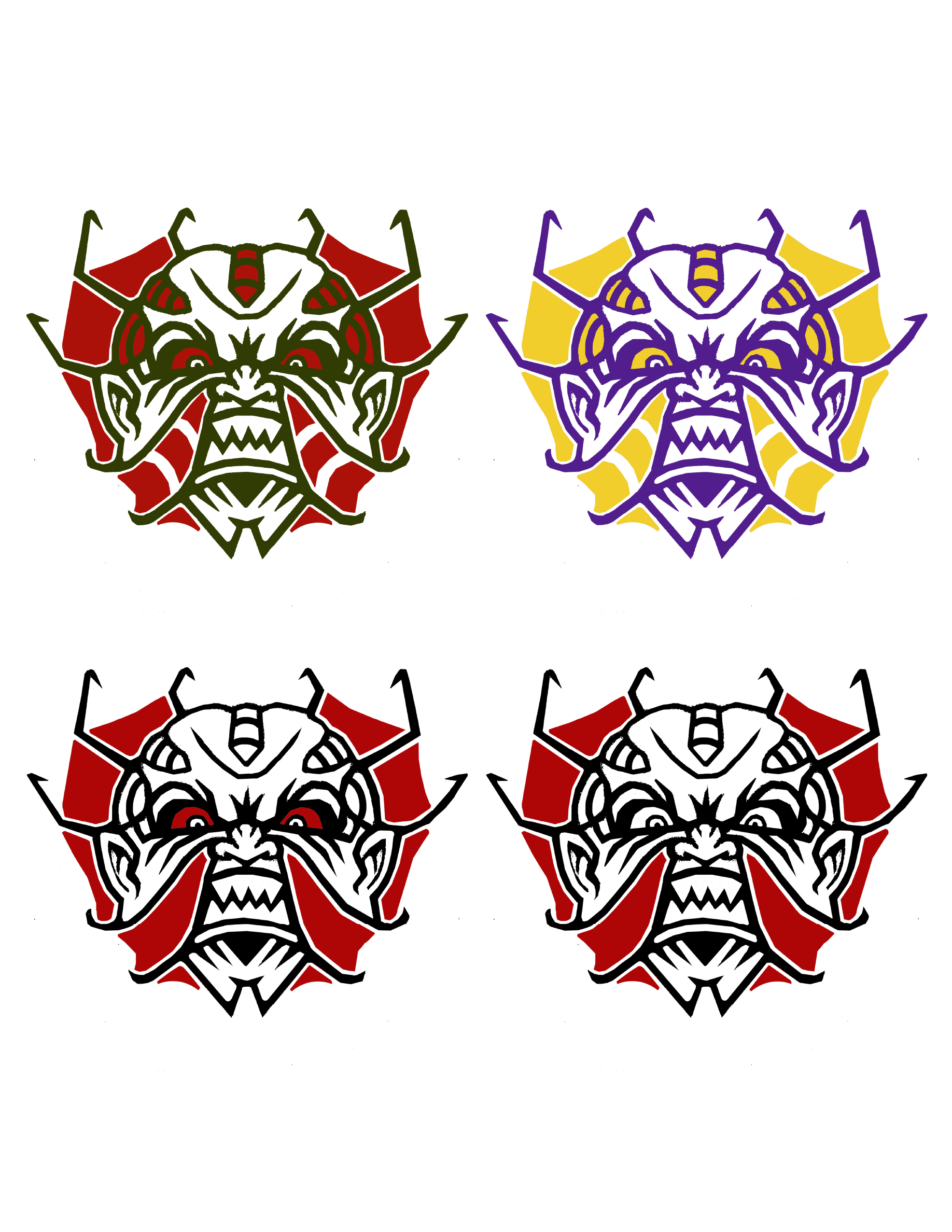
Alternative Colour Options
Final Colour Choice
Colour Choice
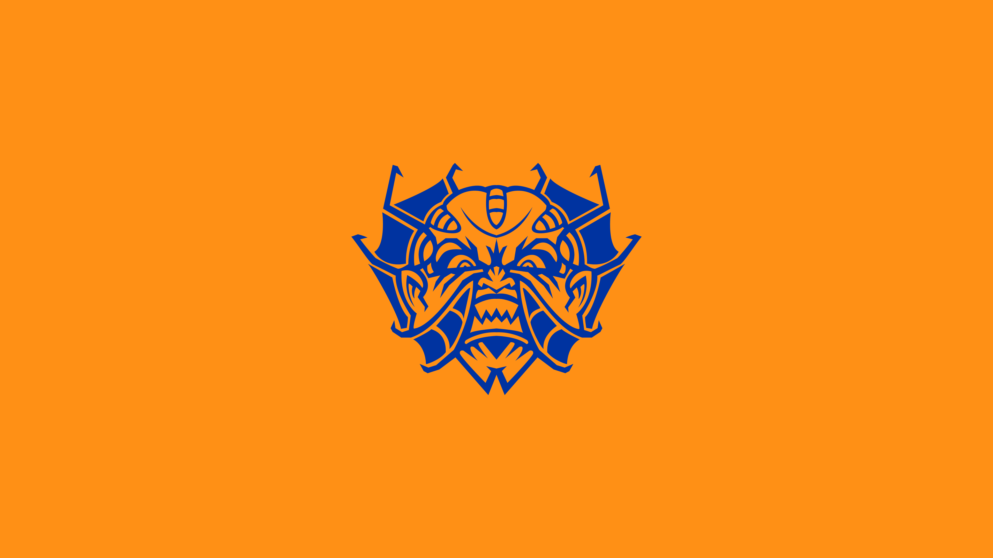
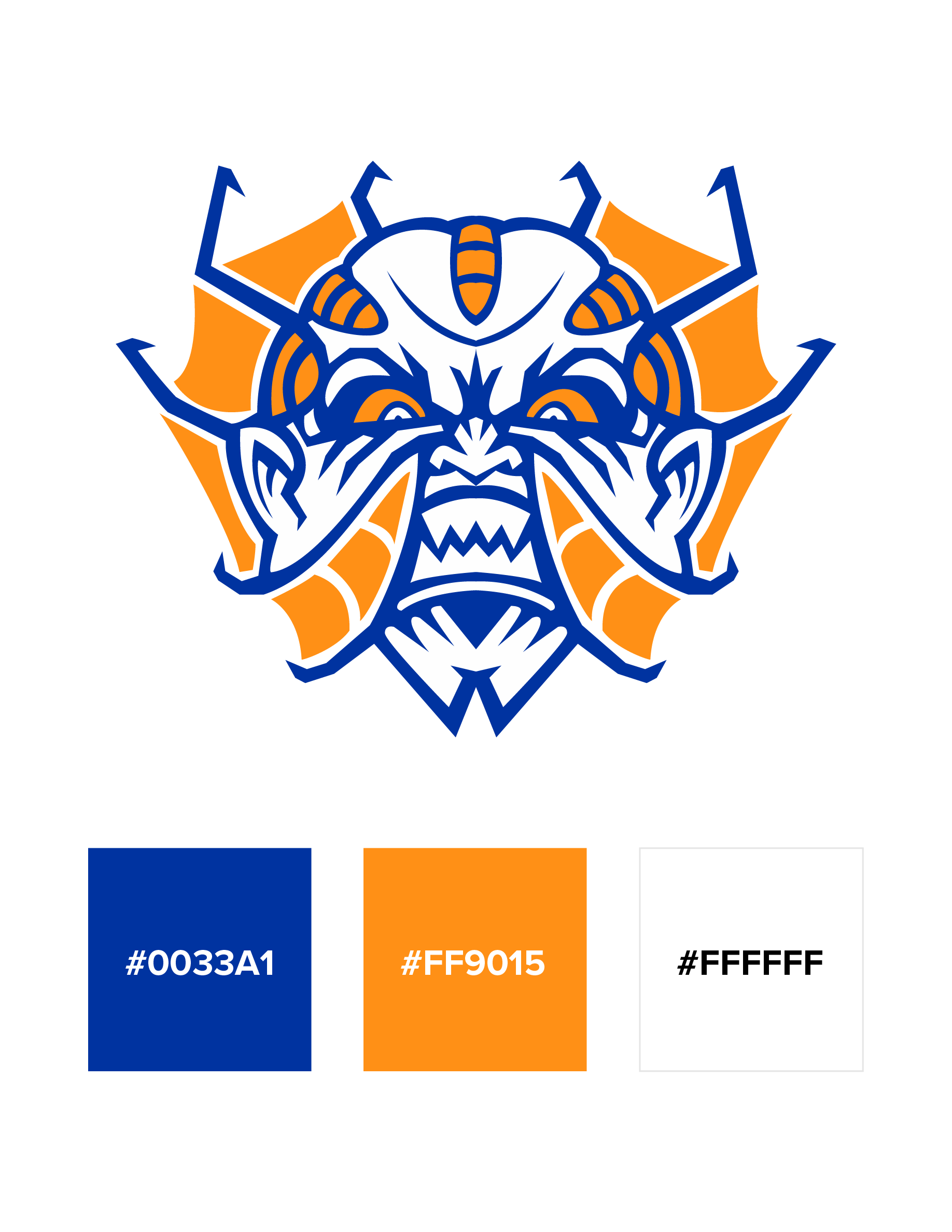
For the colour choices I went with blue and orange. The blue represents his cold demeanour and how he shows no mercy to his prey. The orange is for his frills, during the movies when he is in his full form he spreads his frills like a frilled lizard., I wanted to highlight those features. These colours are also complementary and have harmony.
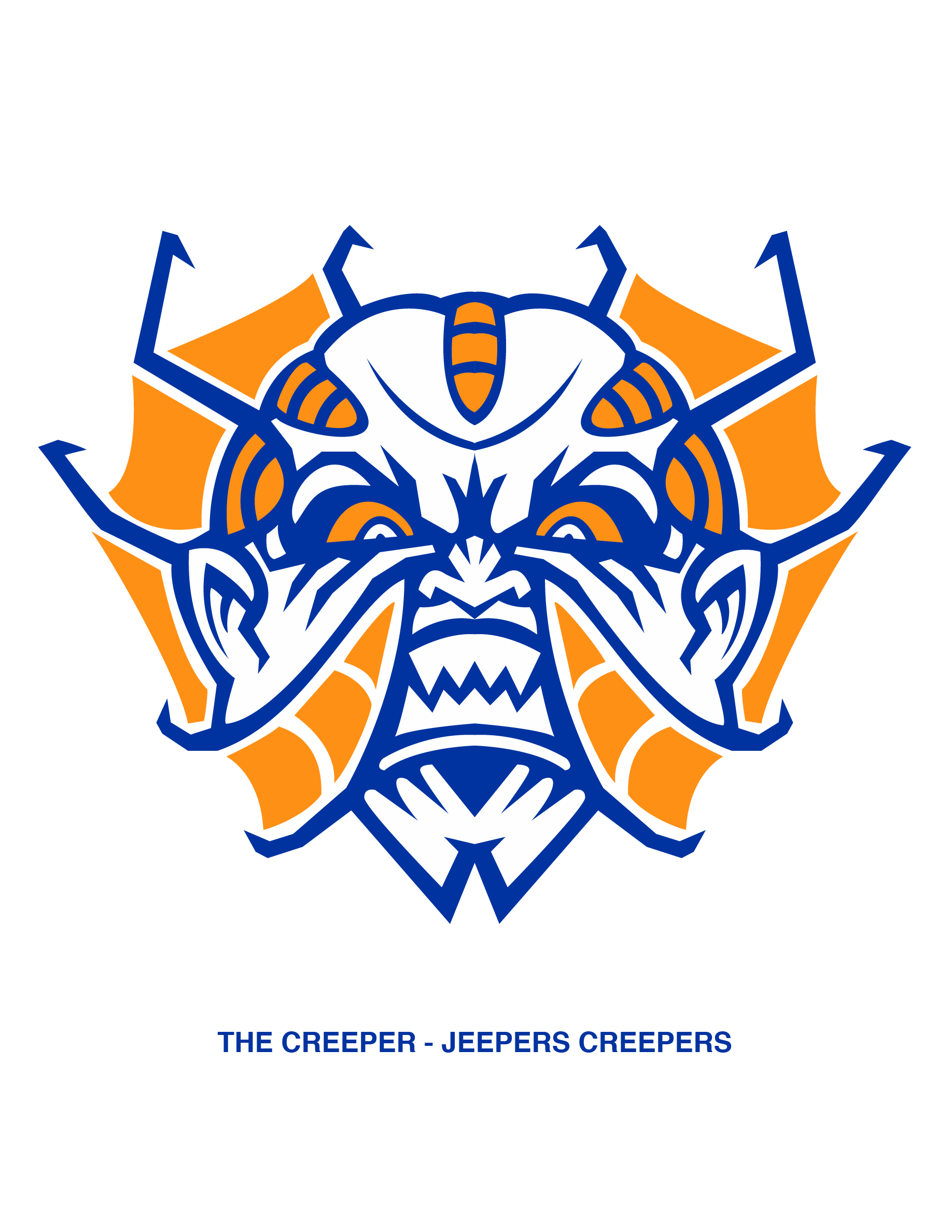
Final Logo Design
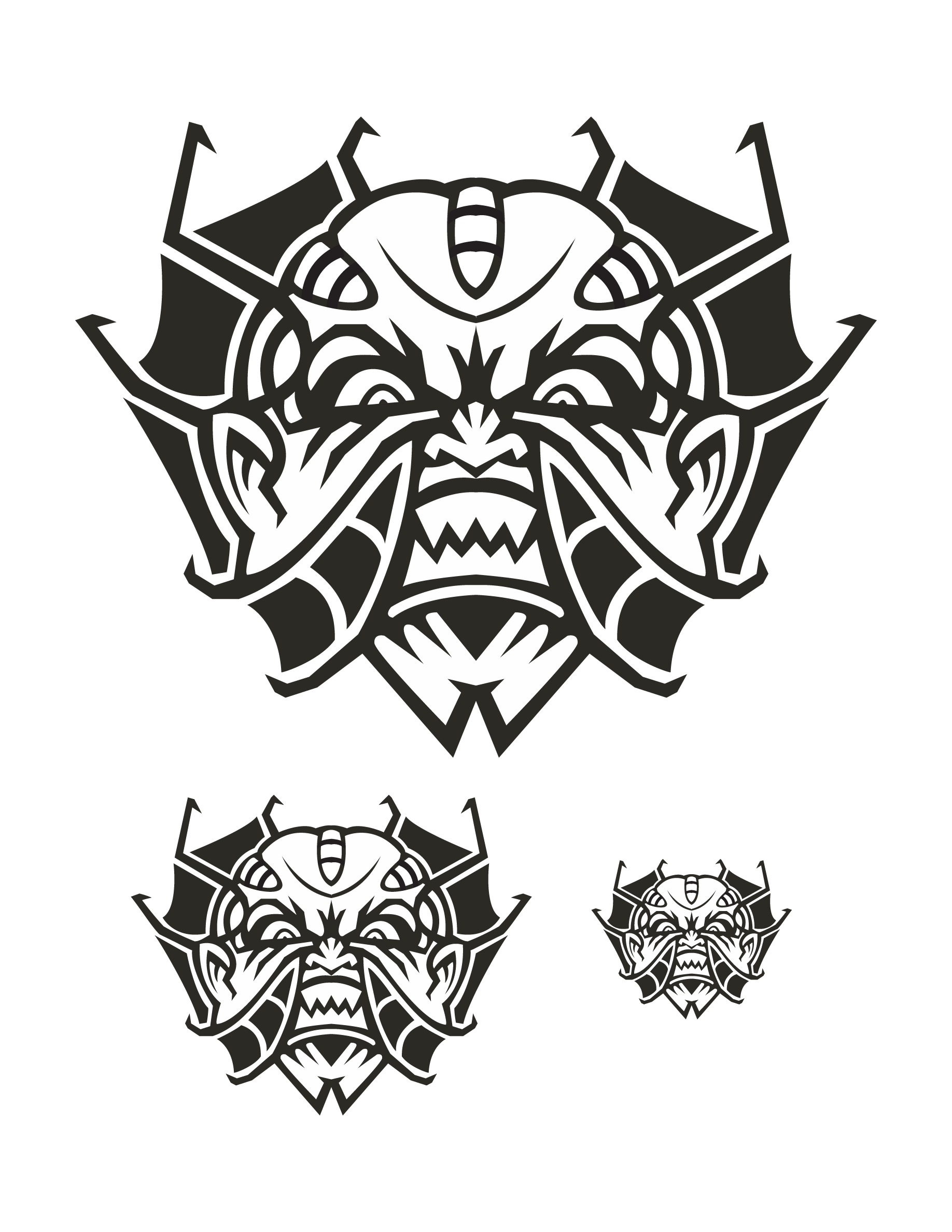
Final Logo Design Black & White
Check out some more case studies