Project
Milkman
This was originally a print that was from 2018, I was tasked to redesign the print and turn it into a motion graphic. I was inspired by vintage cartoons from the 1930s, and my illustration was for an assignment that was about milk statistics in Canada. I wanted the character to be fun and playful, I gave him rosy cheeks and a cute smile.
Inspiration
Previous Design 2018
Rough Sketch of Redesign
Redesign
Milkman's original design was done in colour when I was a first year student but for the motion picture I wanted to stay true to the style and go black and white. He was redesigned to look more like the 1930s, limbs where made thicker, straw was changed, no longer has a nose and his cheeks were made bigger to add to his cute appearance. Overall the redesign is cleaner and better for motion.
Rough Walk Cycle




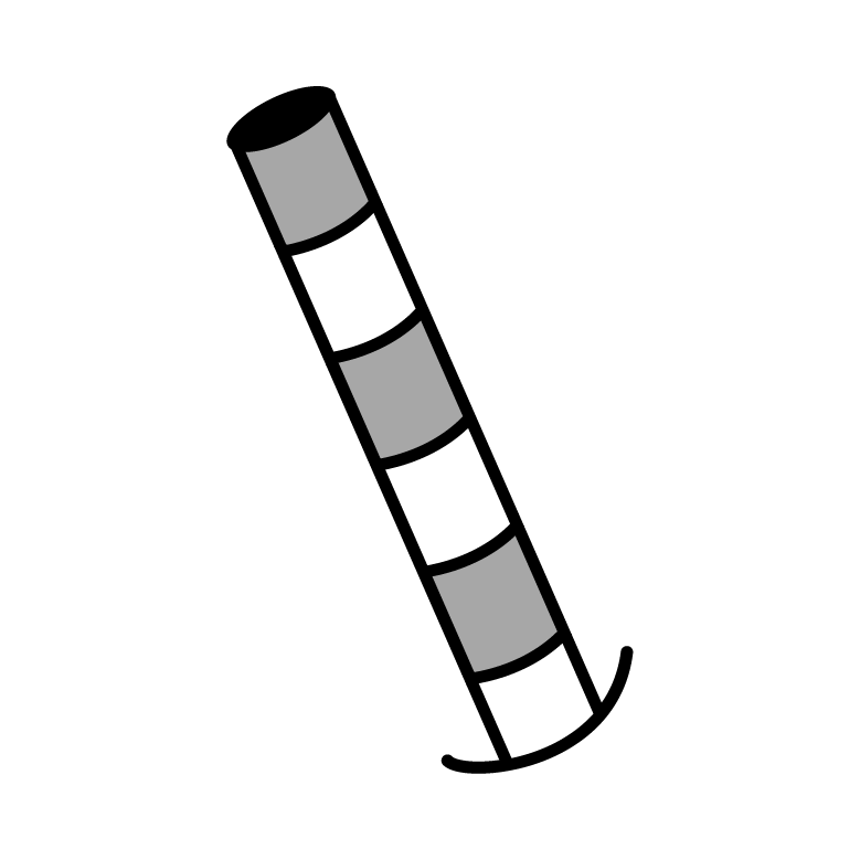
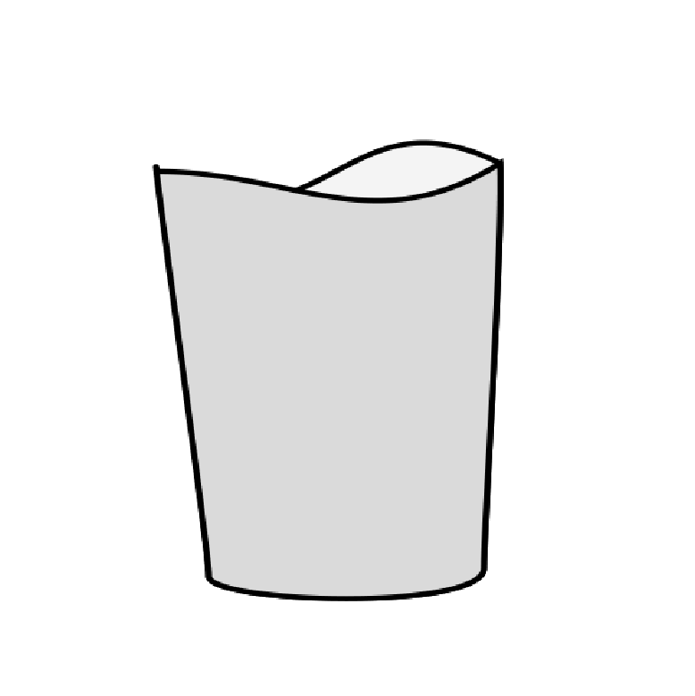
Individual Elements
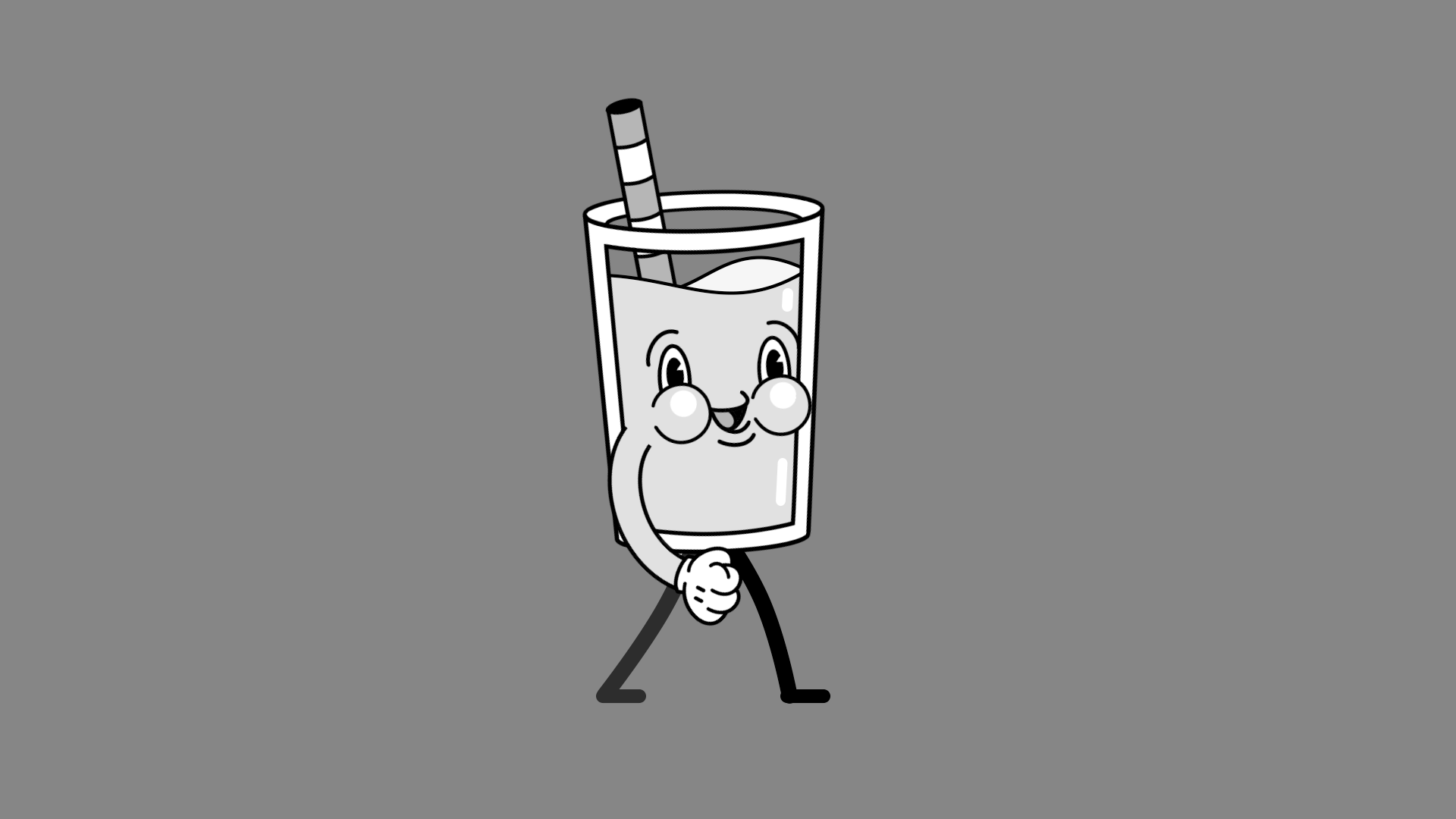

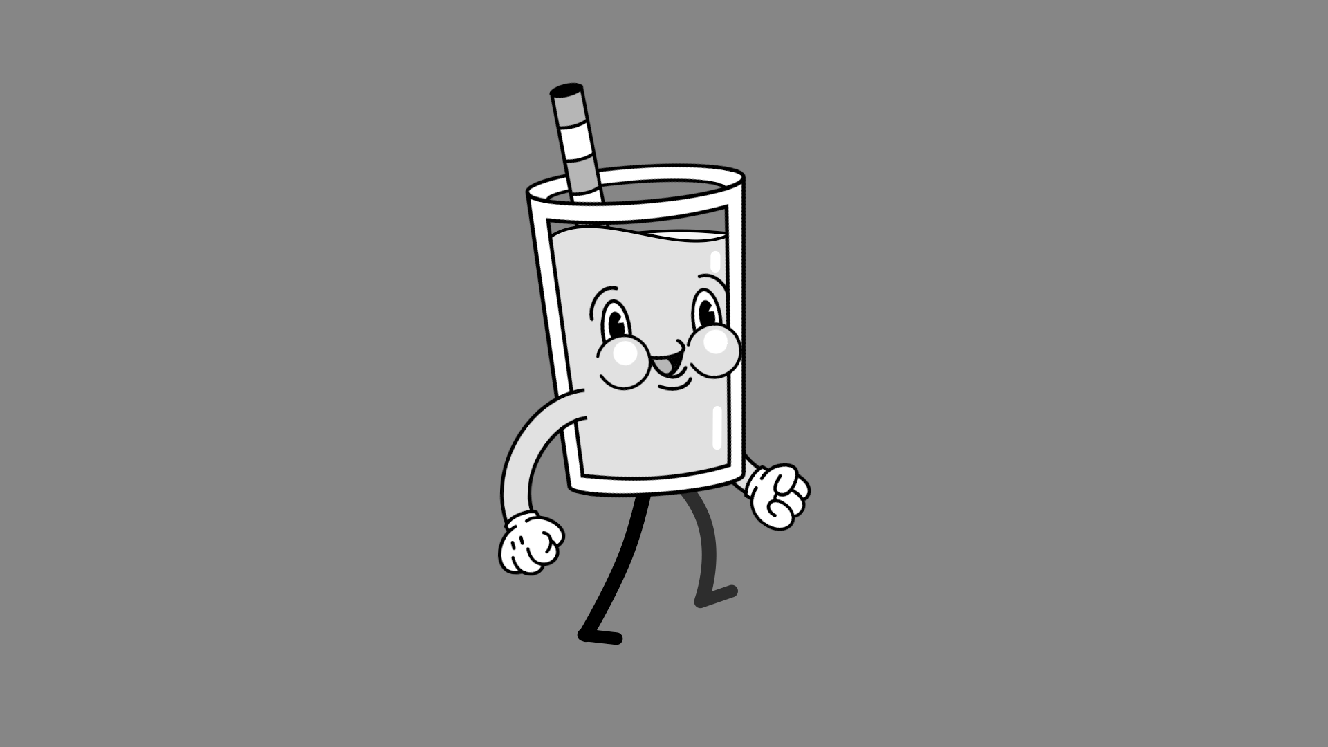
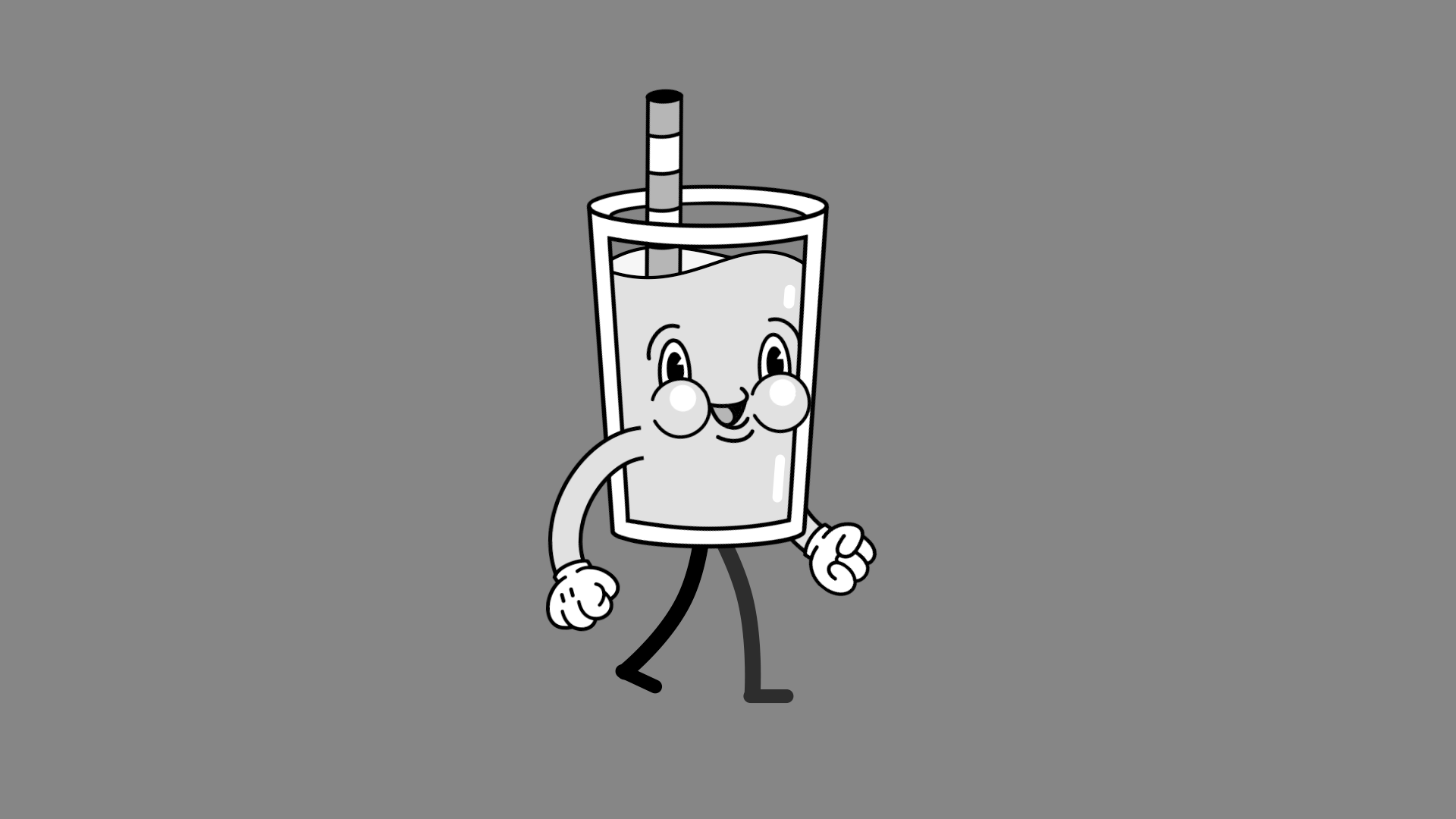
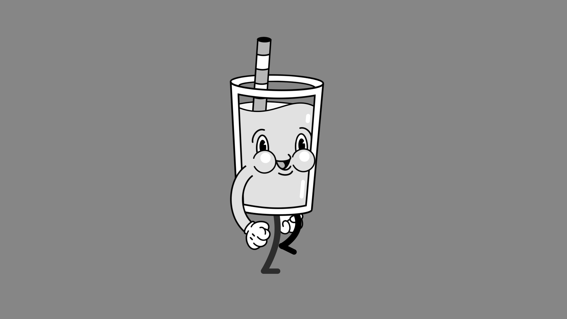

Walk Cycle Storyboards
Motion Graphics
I made the character in Adobe Illustrator, once all the elements were done I then moved to After Effects for motion. Following the principles of animation I made sure that each element was moving - the straw, liquid, face, body and limbs. Once the motion was set I added a vignette and a texture overlay to give it that vintage feel.
Walk Cycle in After Effects
Check out some more case studies
