

Company
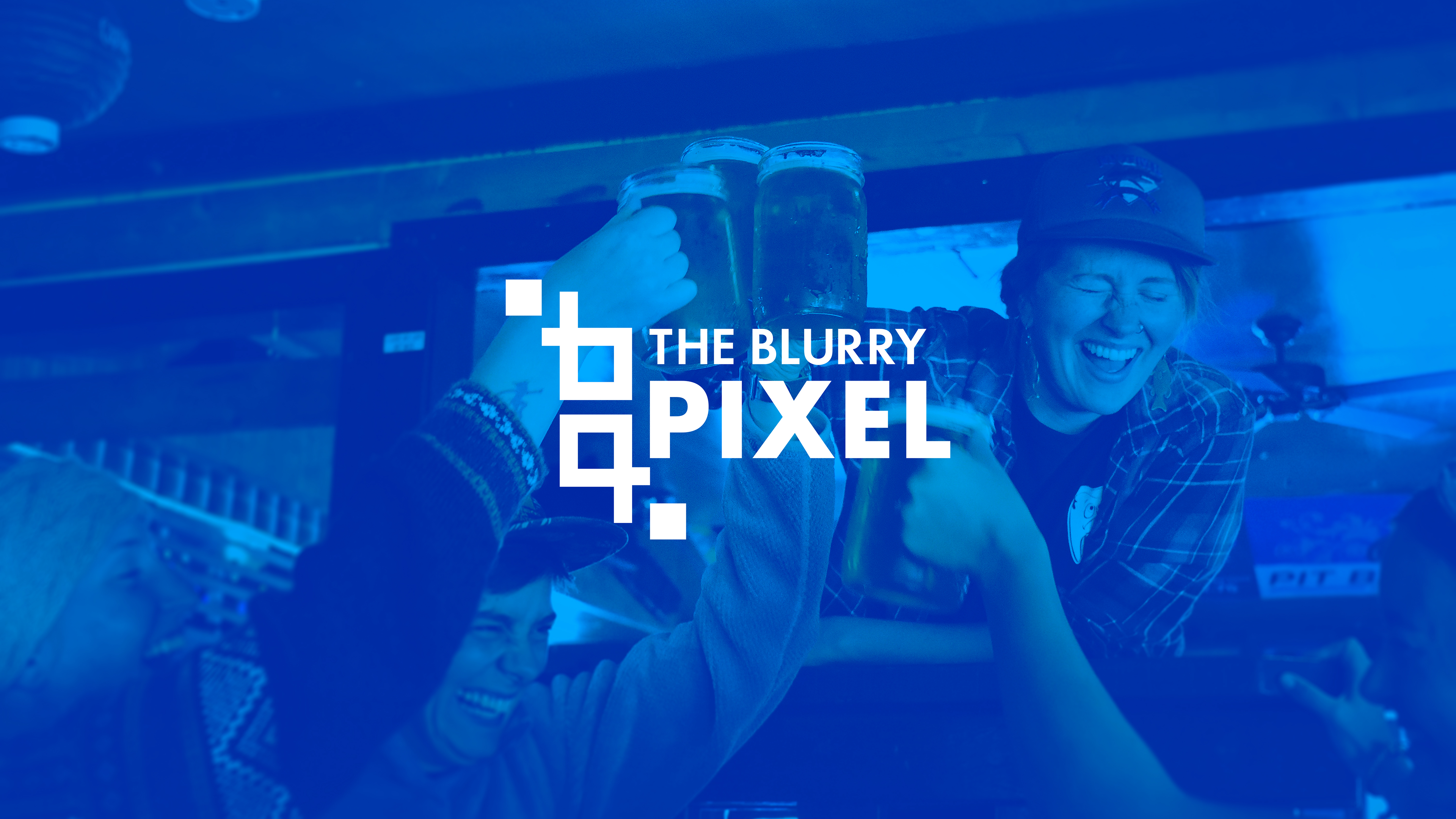
The Blurry Pixel
For a class assignment we were task to redesign a company logo. We had to draw sketches, choose colours that represented the brand, create mockups, stationary and deliver a branding guide for the client.
I decided to go with The Blurry Pixel - it is a video game bar located in Ottawa, Ontario. Their brand is to combine great food and service with some video games at your table. Considering their market is young adults, the company needed to update their logo to a more modern design.
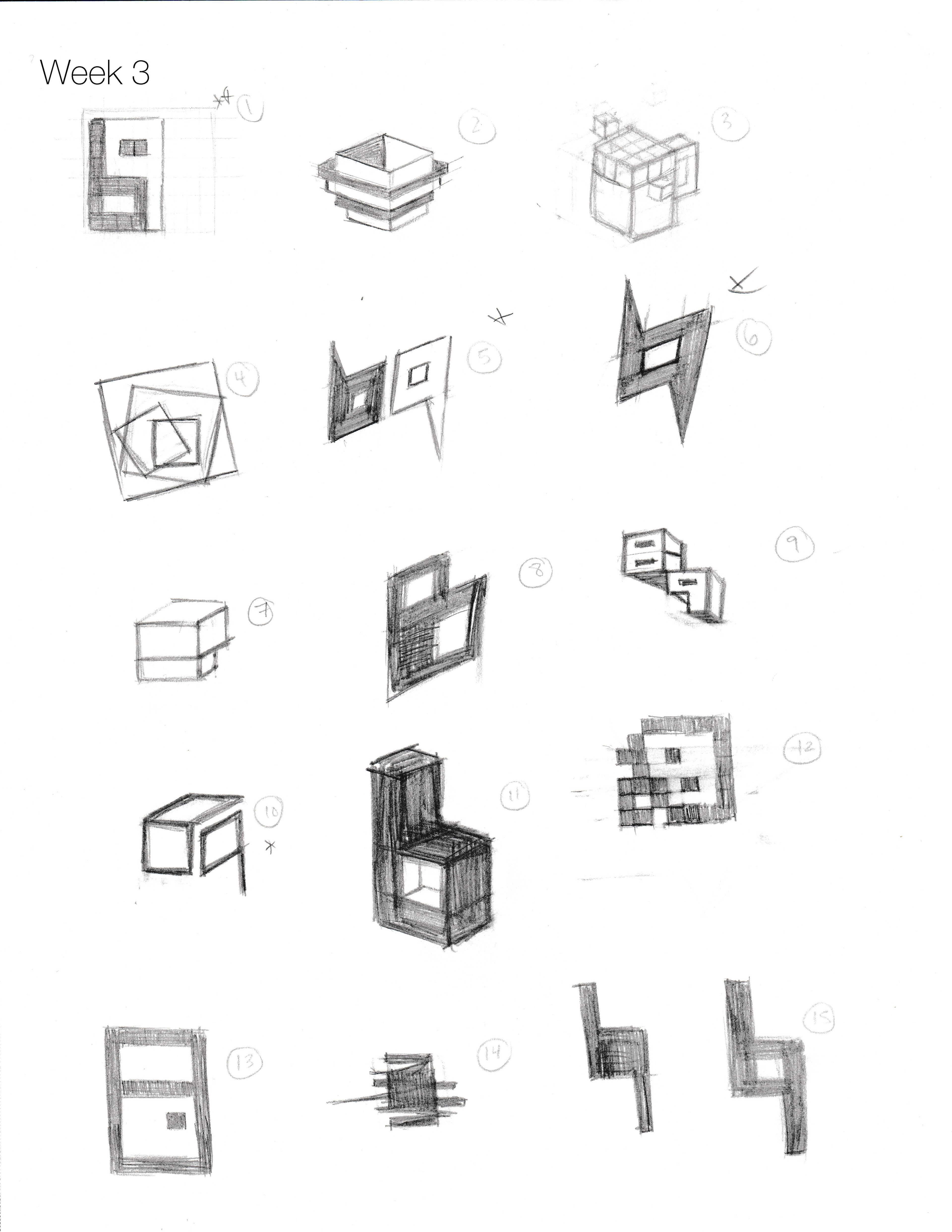
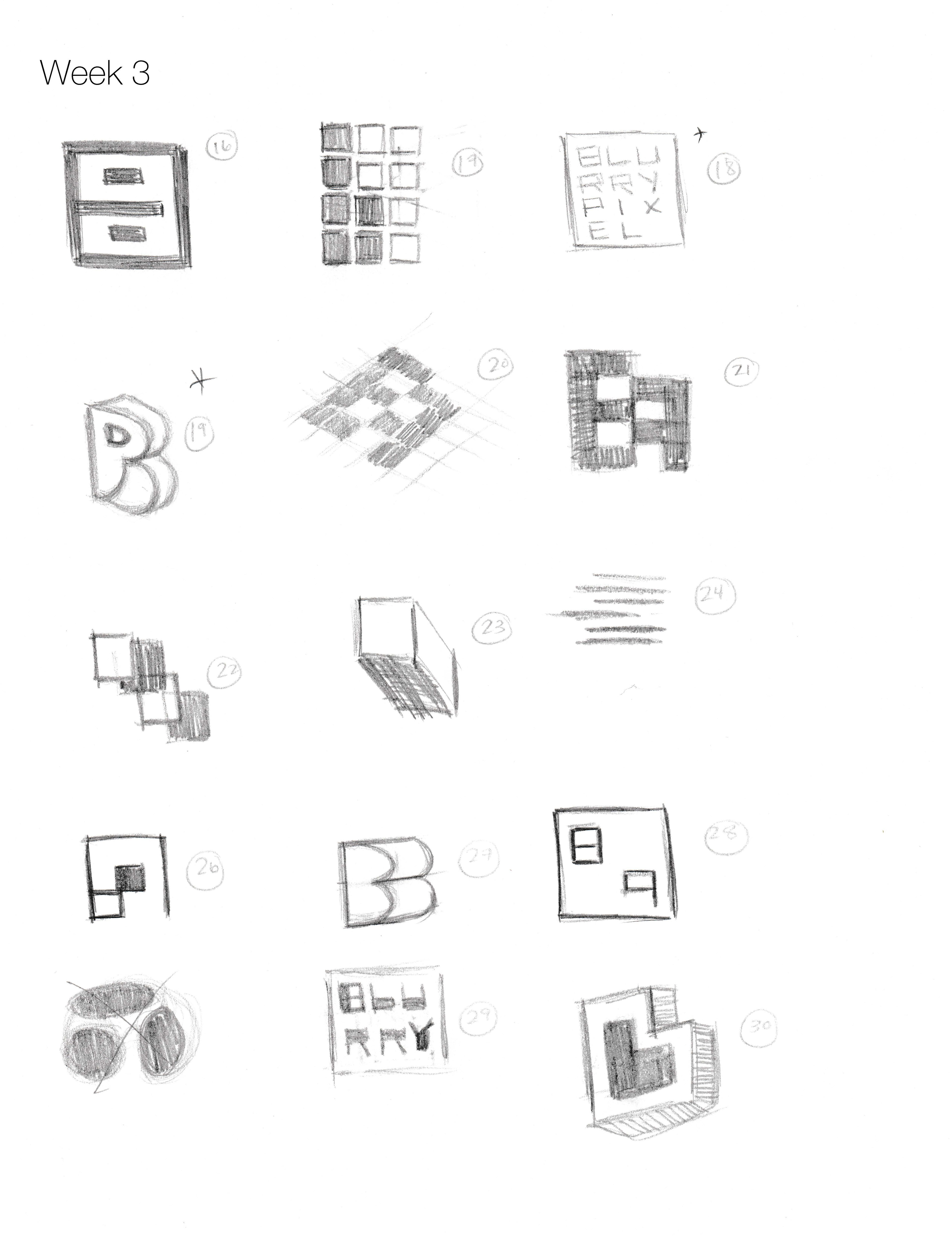
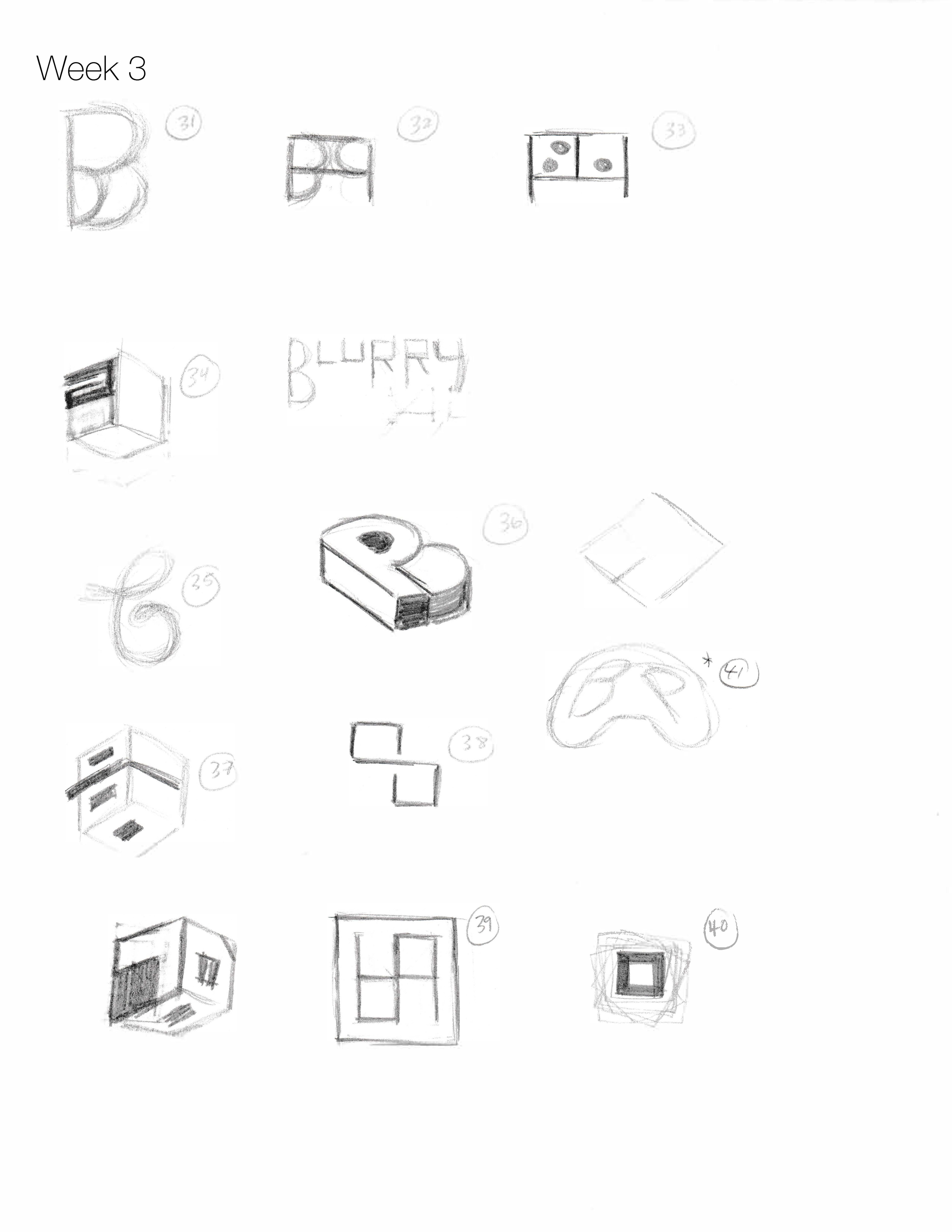
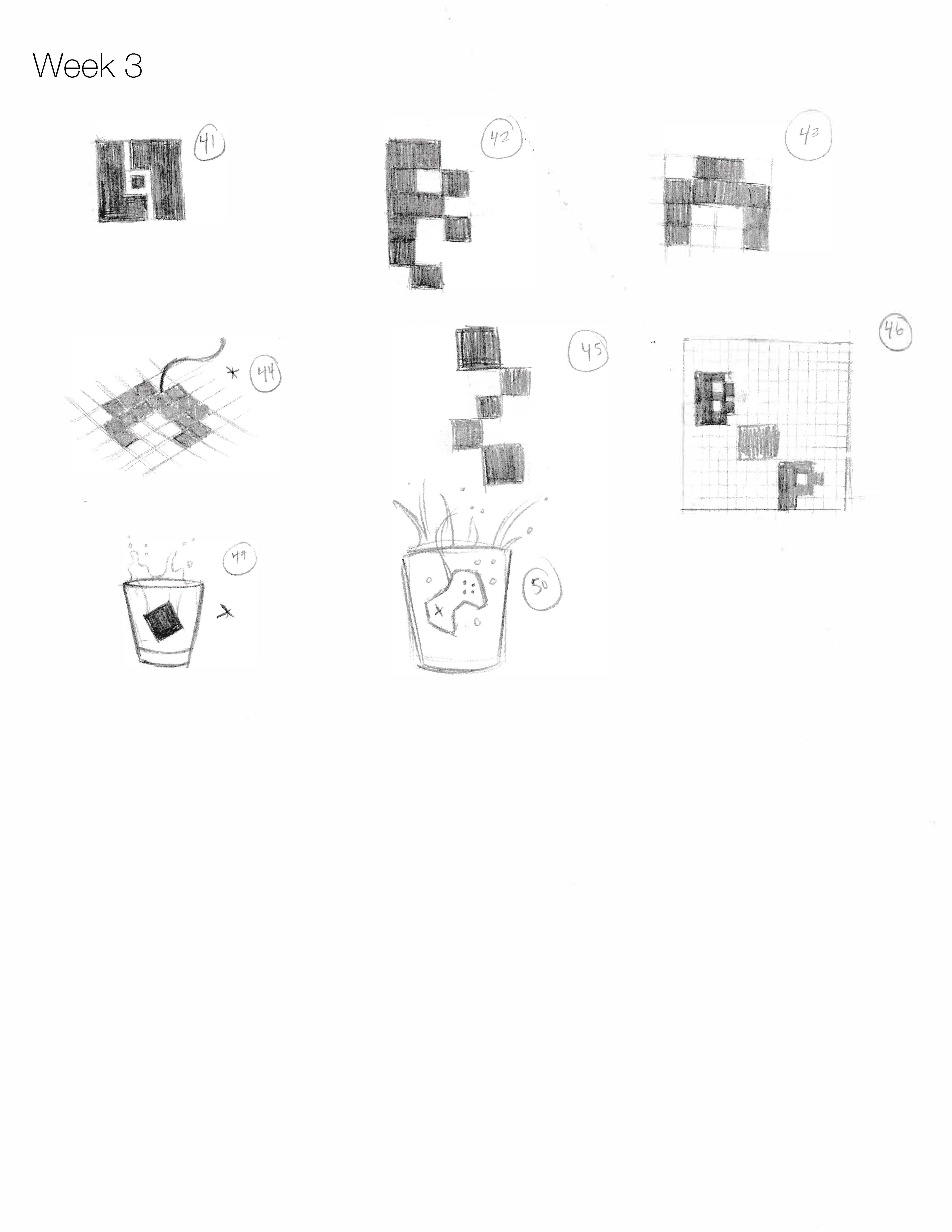
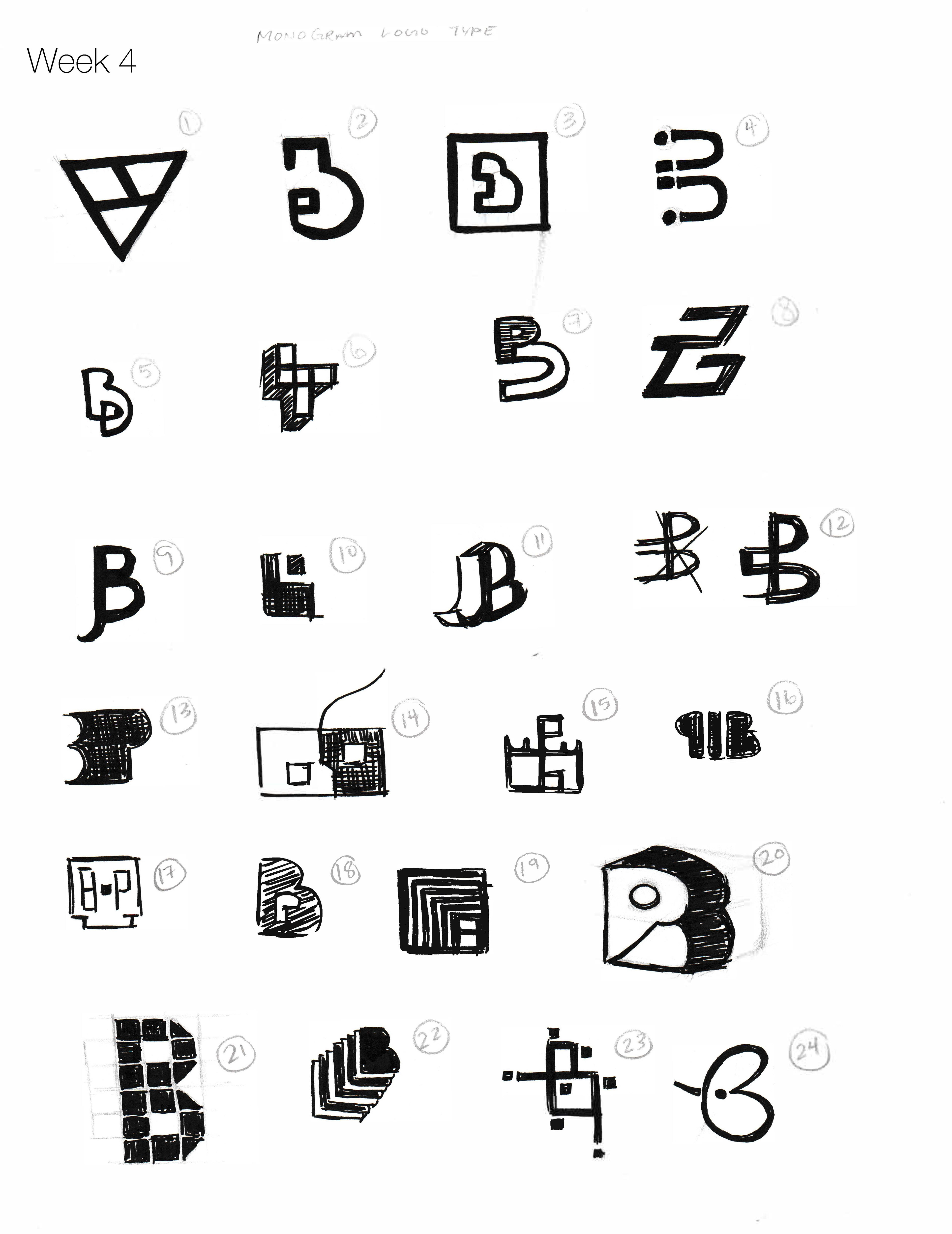


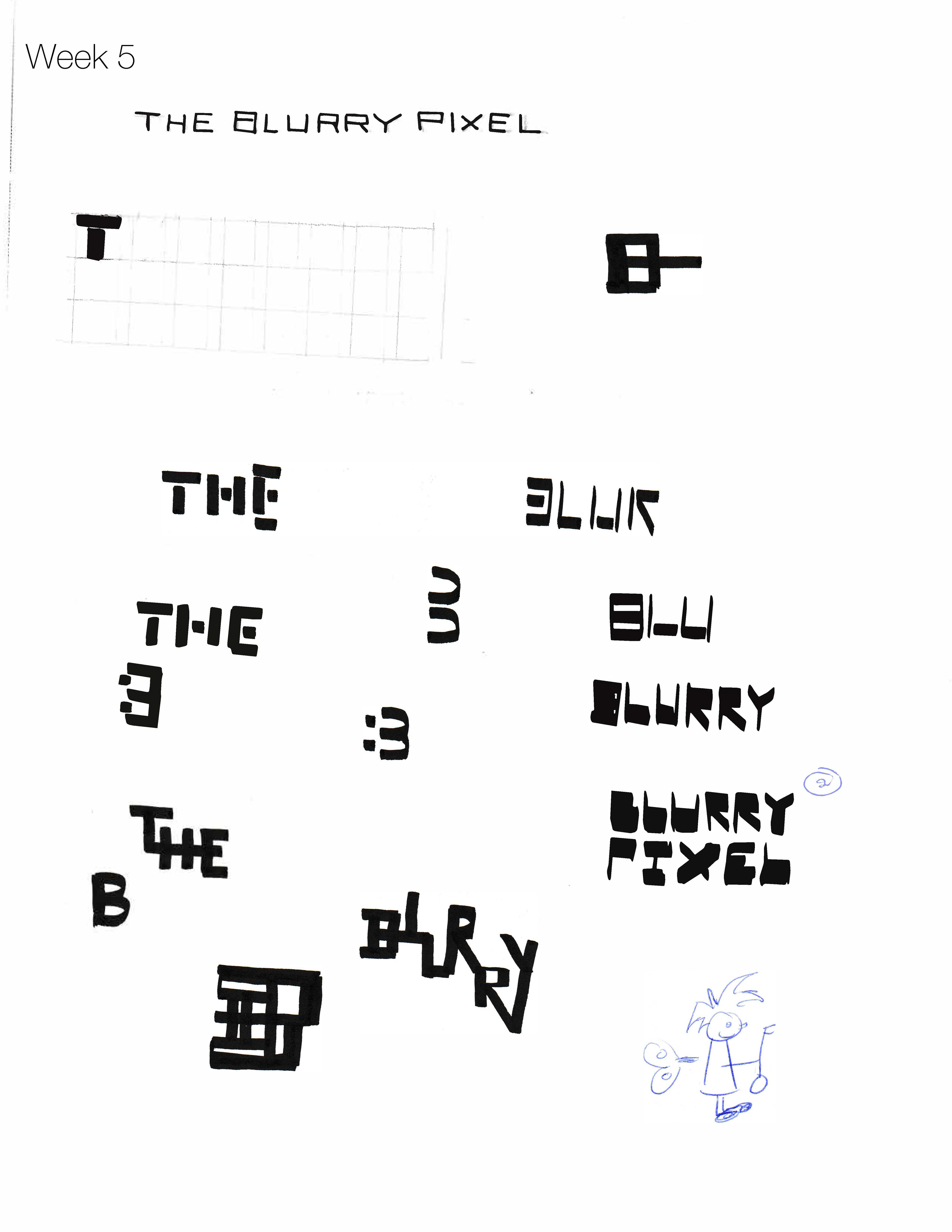
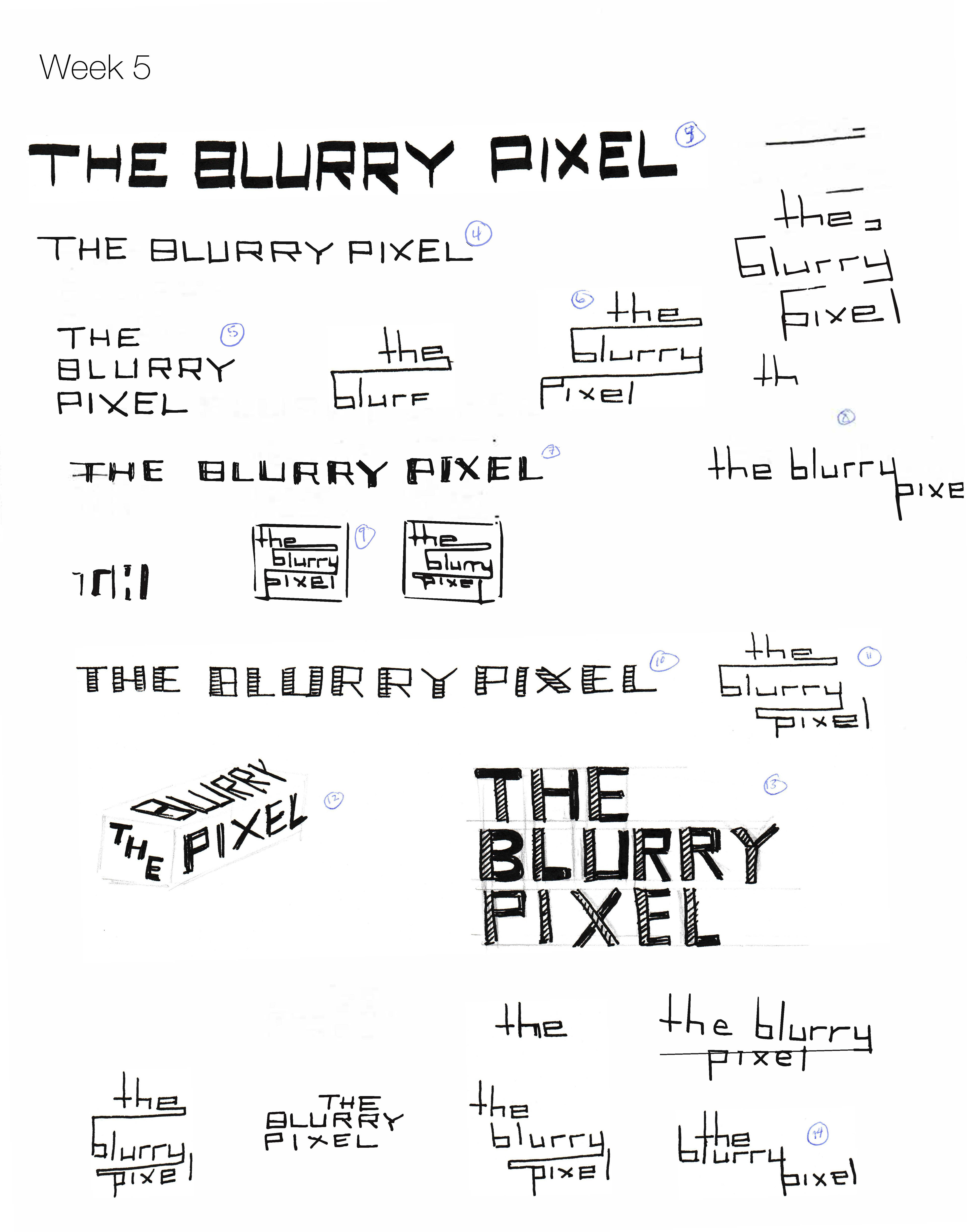
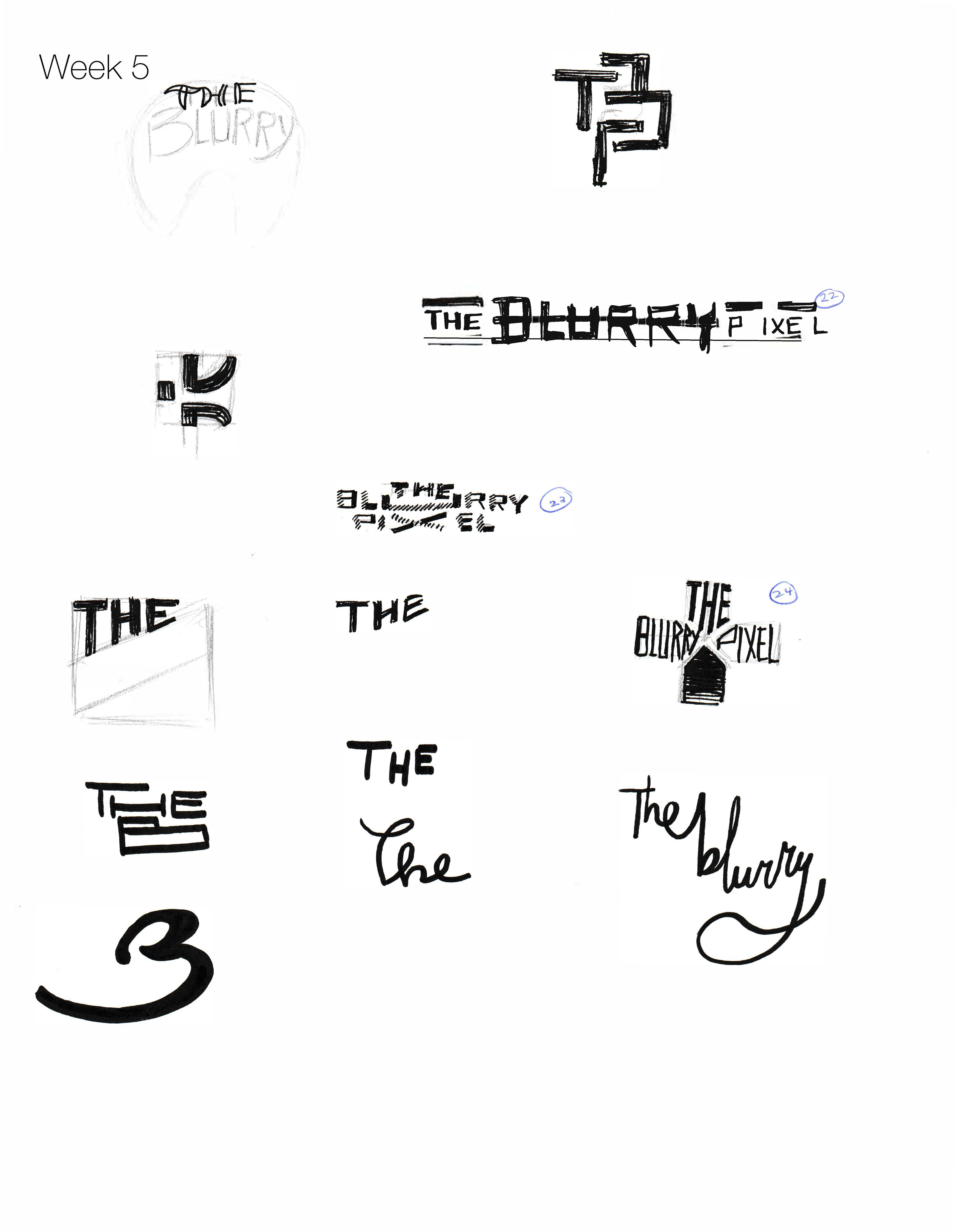
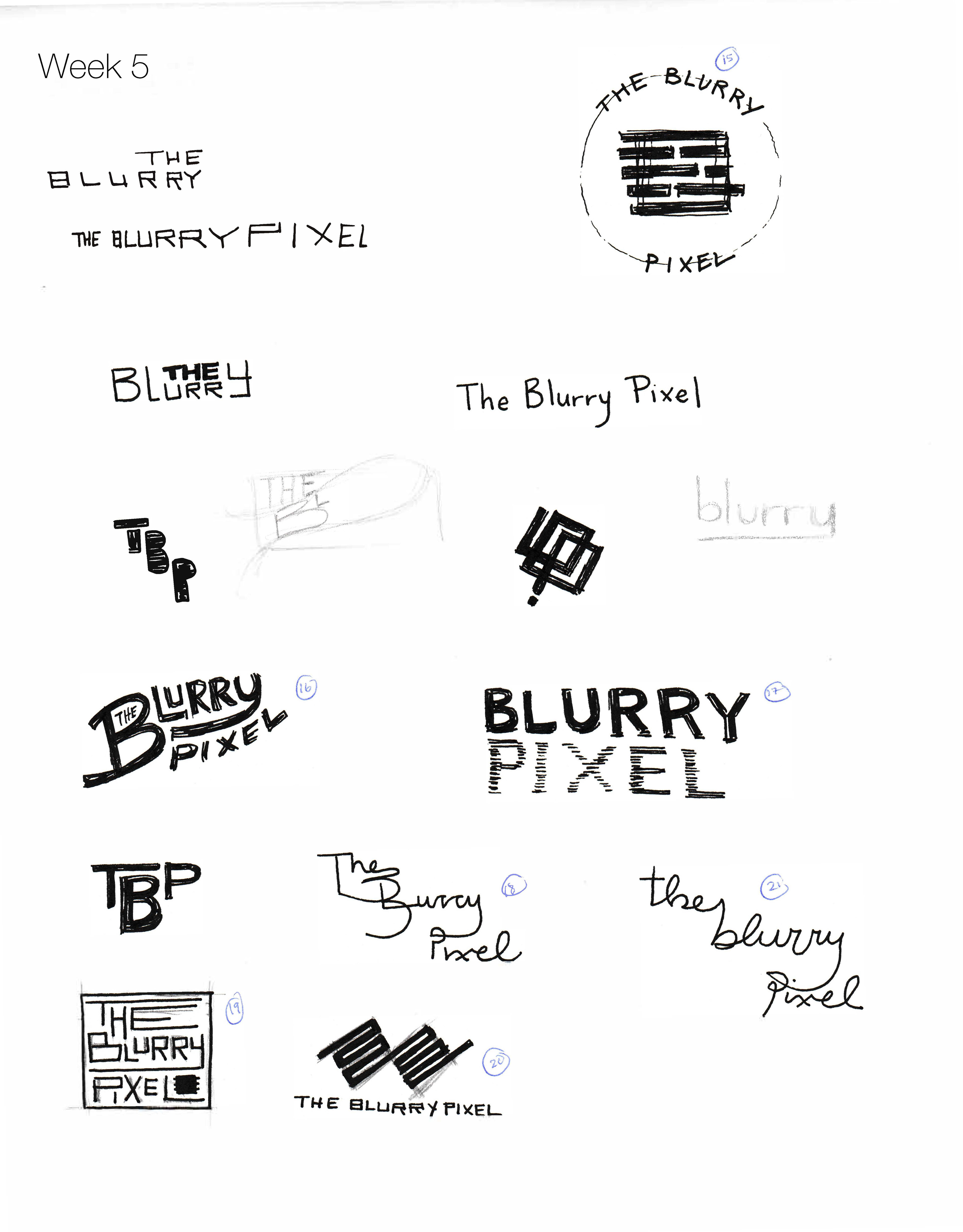
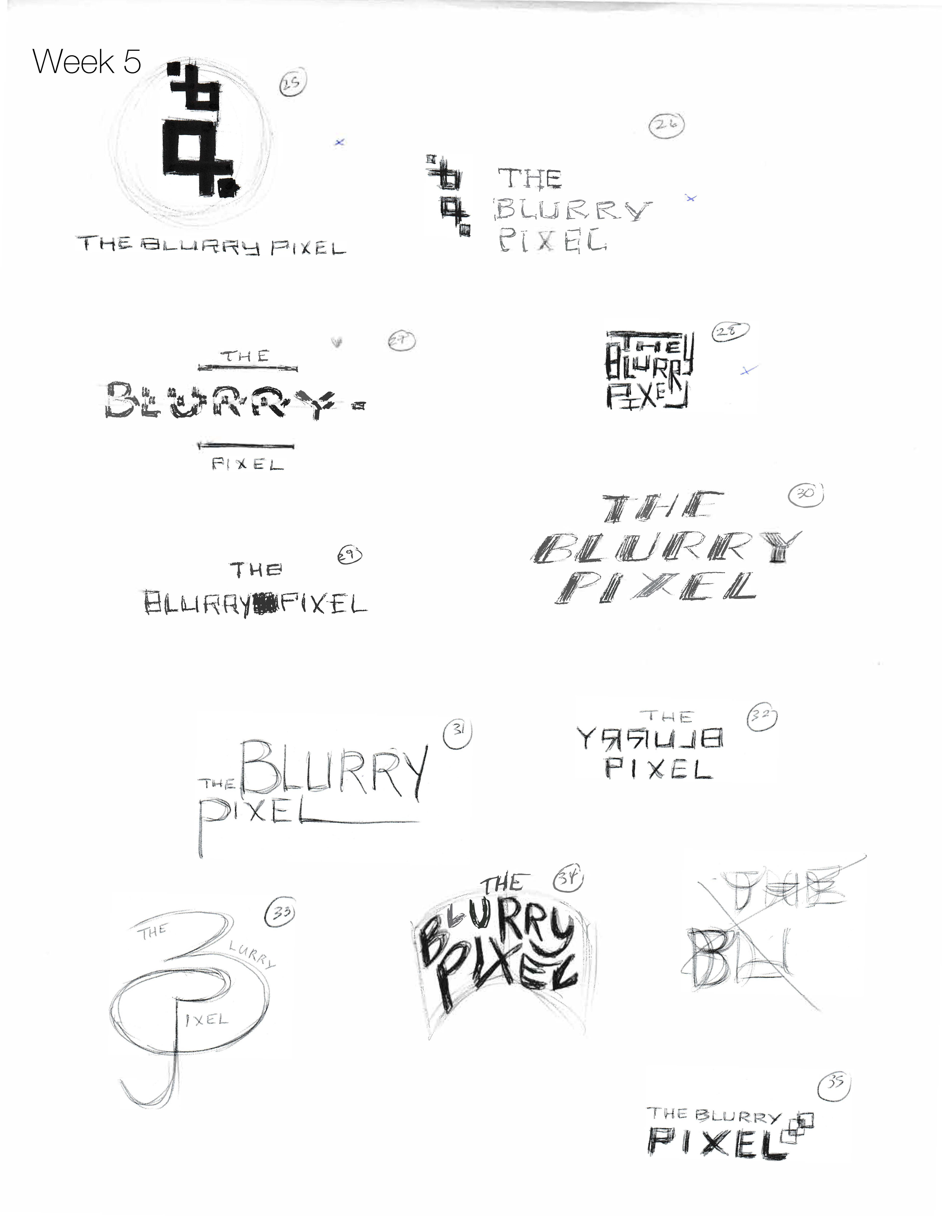
Logo Sketches
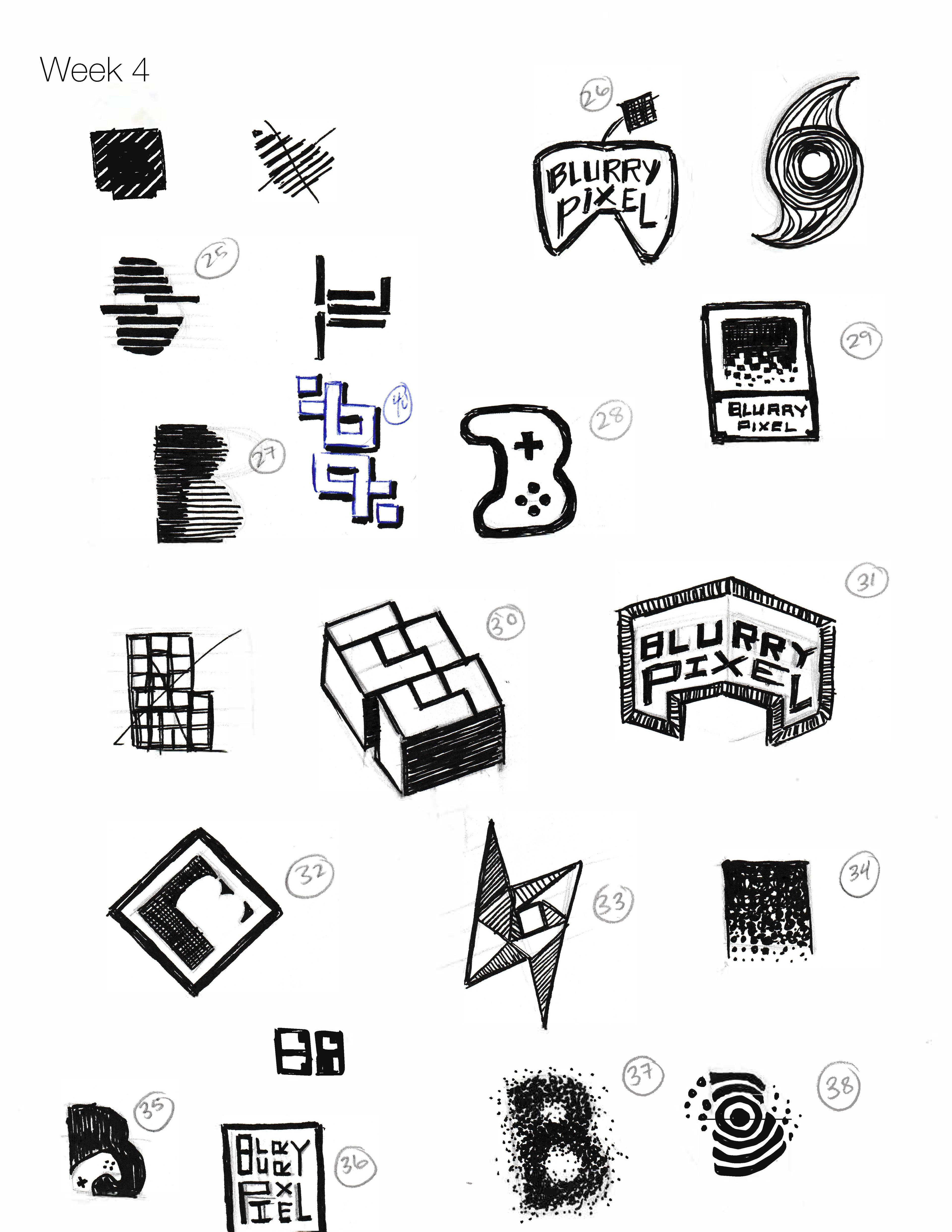
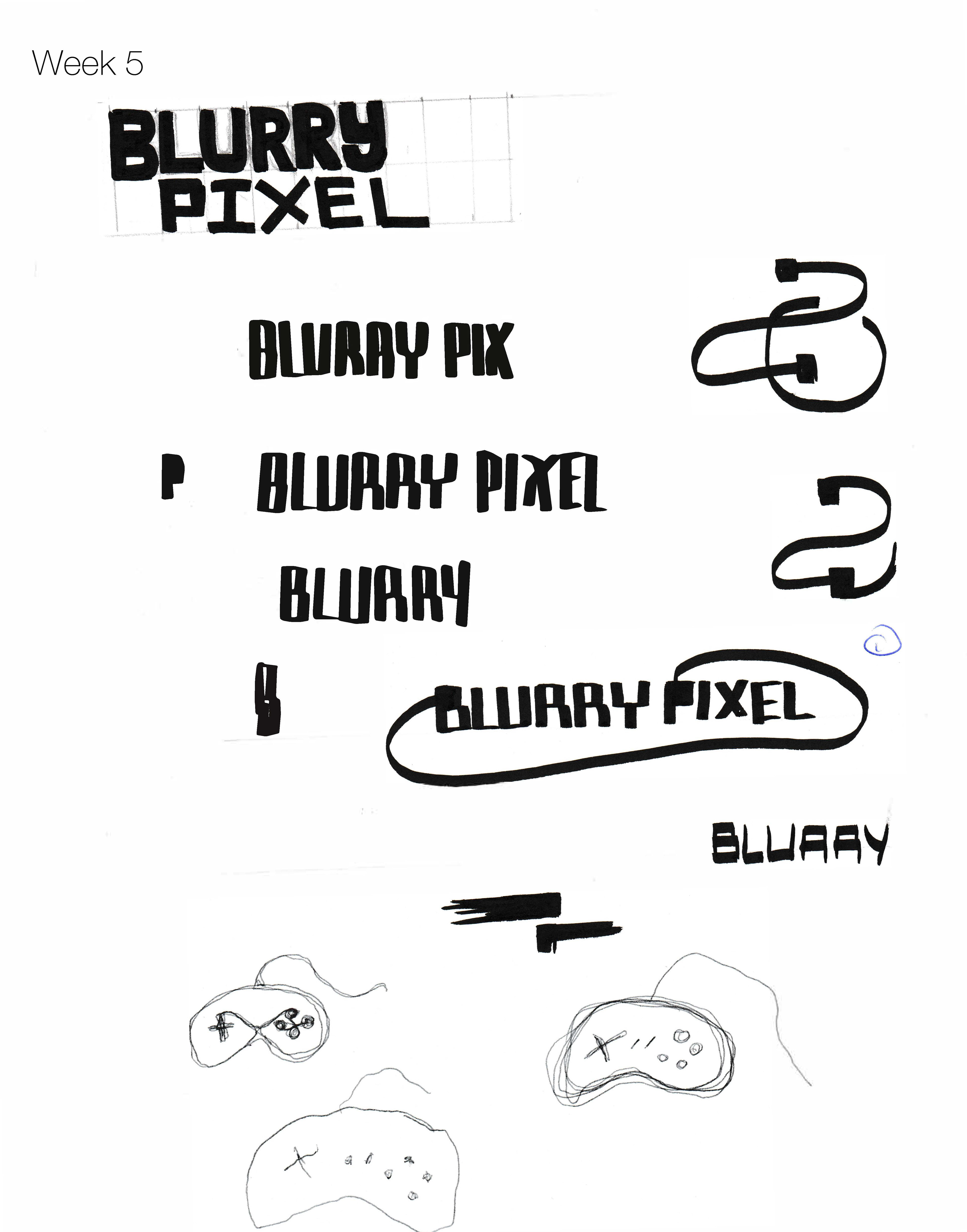
Design & Concept
Since the brand was based on video games I wanted to design a logo that reflected that. I started with using pixels as my base and created blocked designs as letterforms and symbols. At the end of the sketching I came up with a logo that showed the "B" and "P", representing the name The Blurry Pixel. I added two pixels to the side to give it weight and added the name next to the symbol.
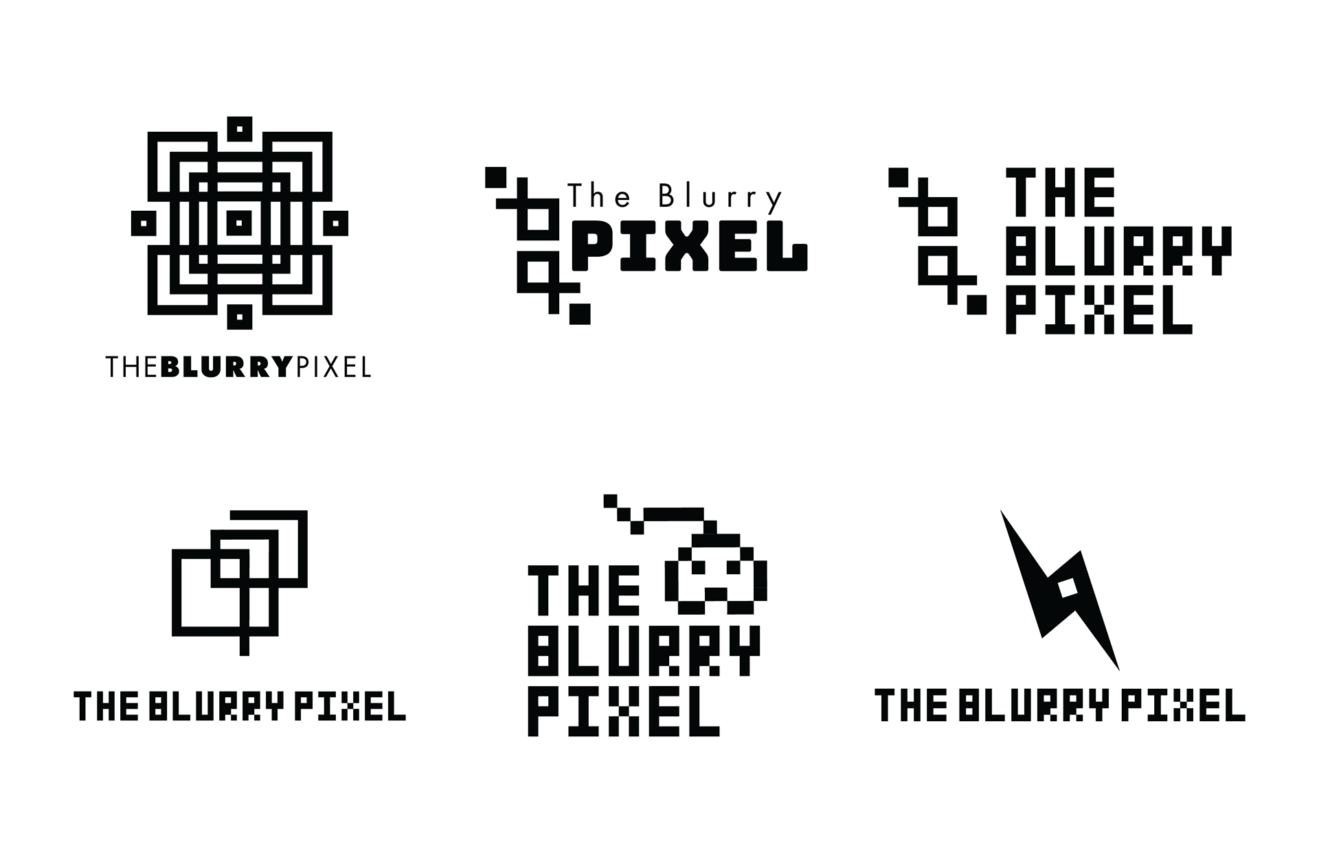
Logo Concepts
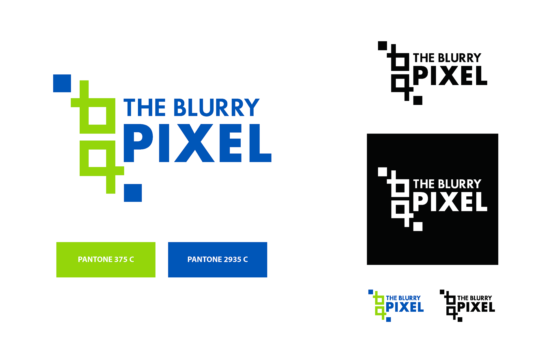
Final Concept & Colour

Business Cards
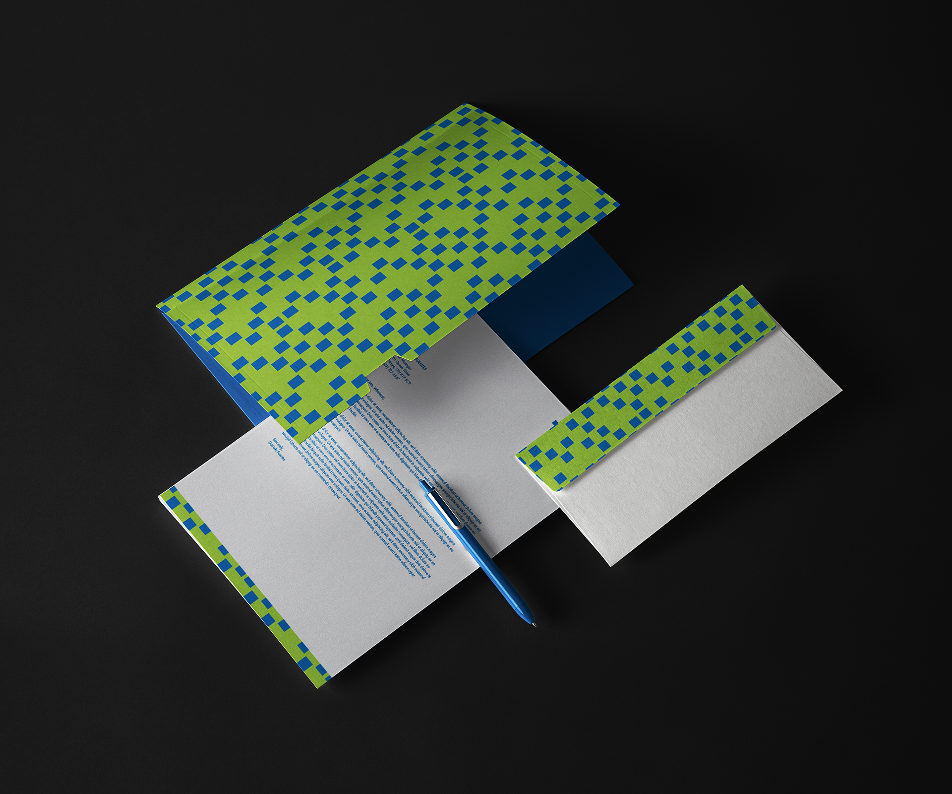
Folder, Letterhead & Envelope
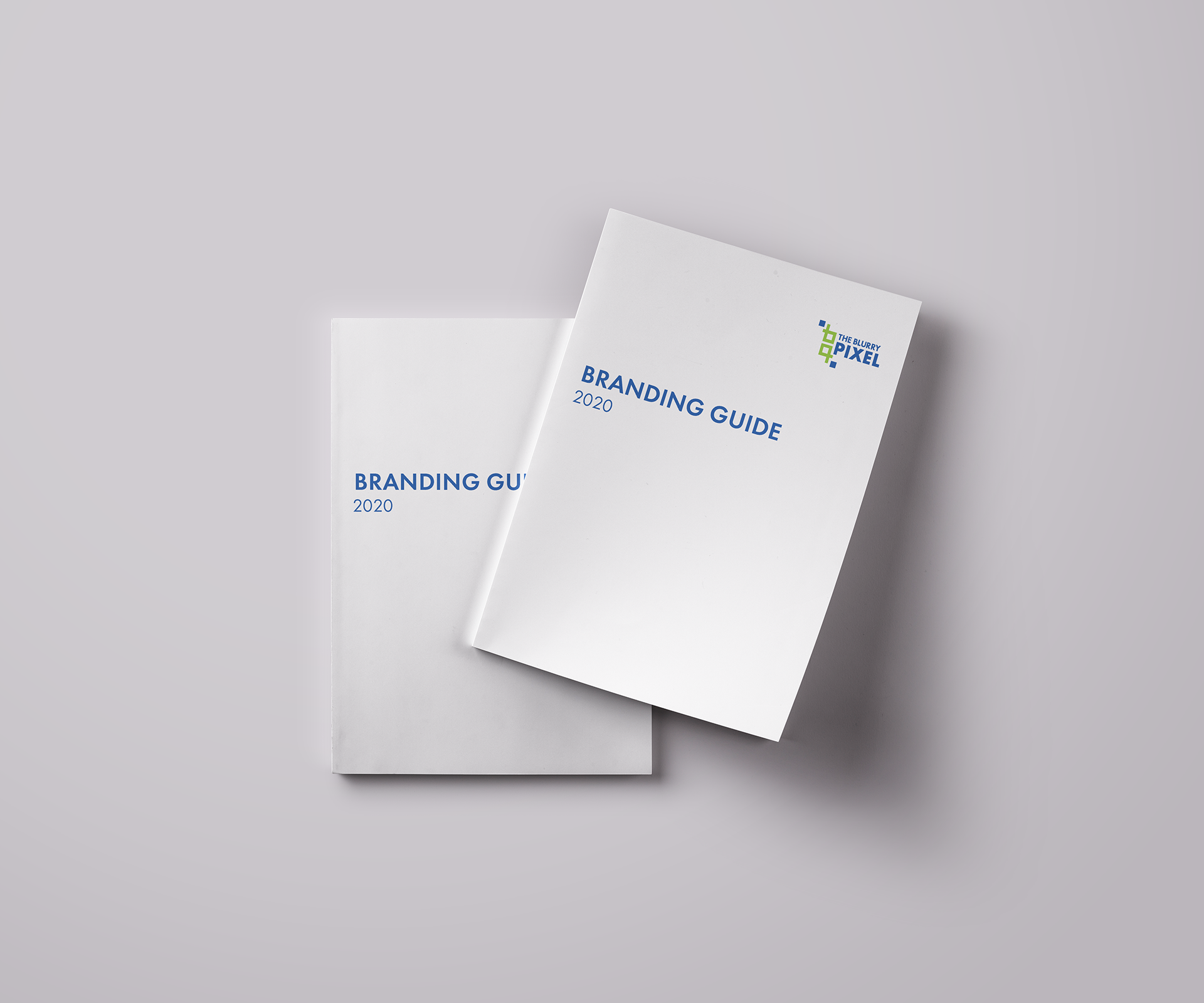
Stationary
& Branding Guide
For the stationary and branding guide I incorporated elements from the final logo into the look. I used the blue pixels and green to create a wallpaper for each stationary item. The business card is also in the same shape as a pixel, reflecting the brand. These designs were created to bring new life into The Blurry Pixel - make it more professional and stand out.
Branding Guide Front
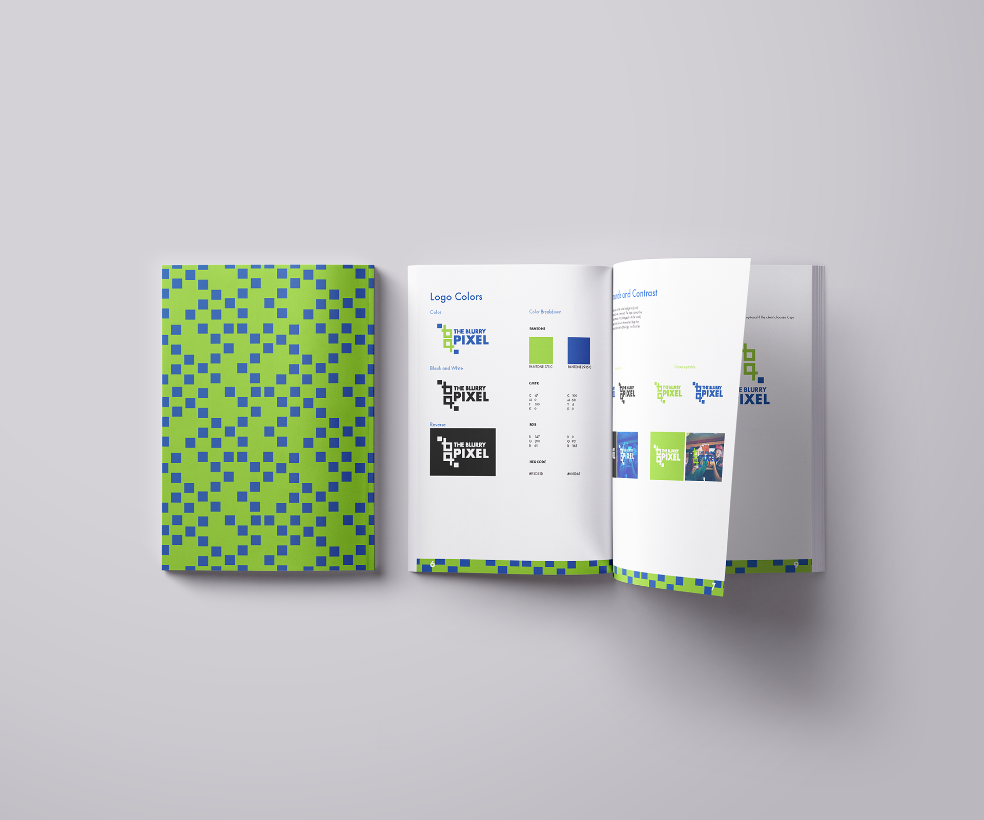
Branding Guide Back & Inside
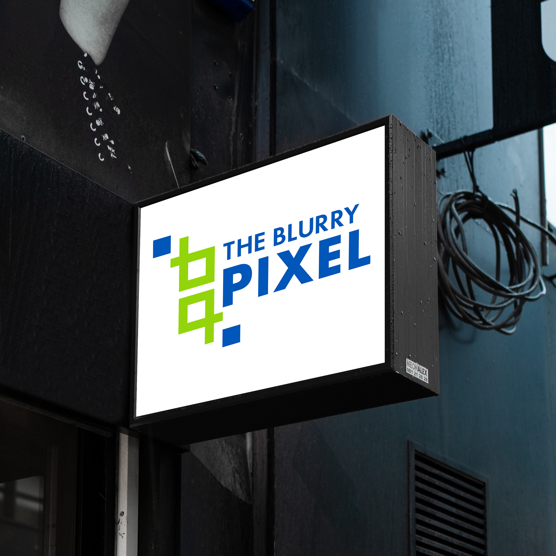
Storefront Sign
Check out some more case studies